CHURCH BRANDING & RESOURCES
Hope For Life Christian Fellowship - Rebrand
Hope For Life's brand and website needed an update as the visuals felt like they no longer accurately represented the vitality of the community as it had grown and changed since its origins. The brief was to represent the community and how the connections within the community influenced the lives of its members, all centred around the cross and the lordship of Jesus. The variety of colours are meant to represent their diverse and vibrant community and how their lives overlap and recolour the lives of others, all circling the one thing that binds the church together, the cross.
We produced a new visual identity and website as well as tertiary resources such as infographics, songbooks and slide templates to help this new visual identity be consistent in as many areas as we could manage.


WESTSIDE KINGS CHURCH - JOURNALS
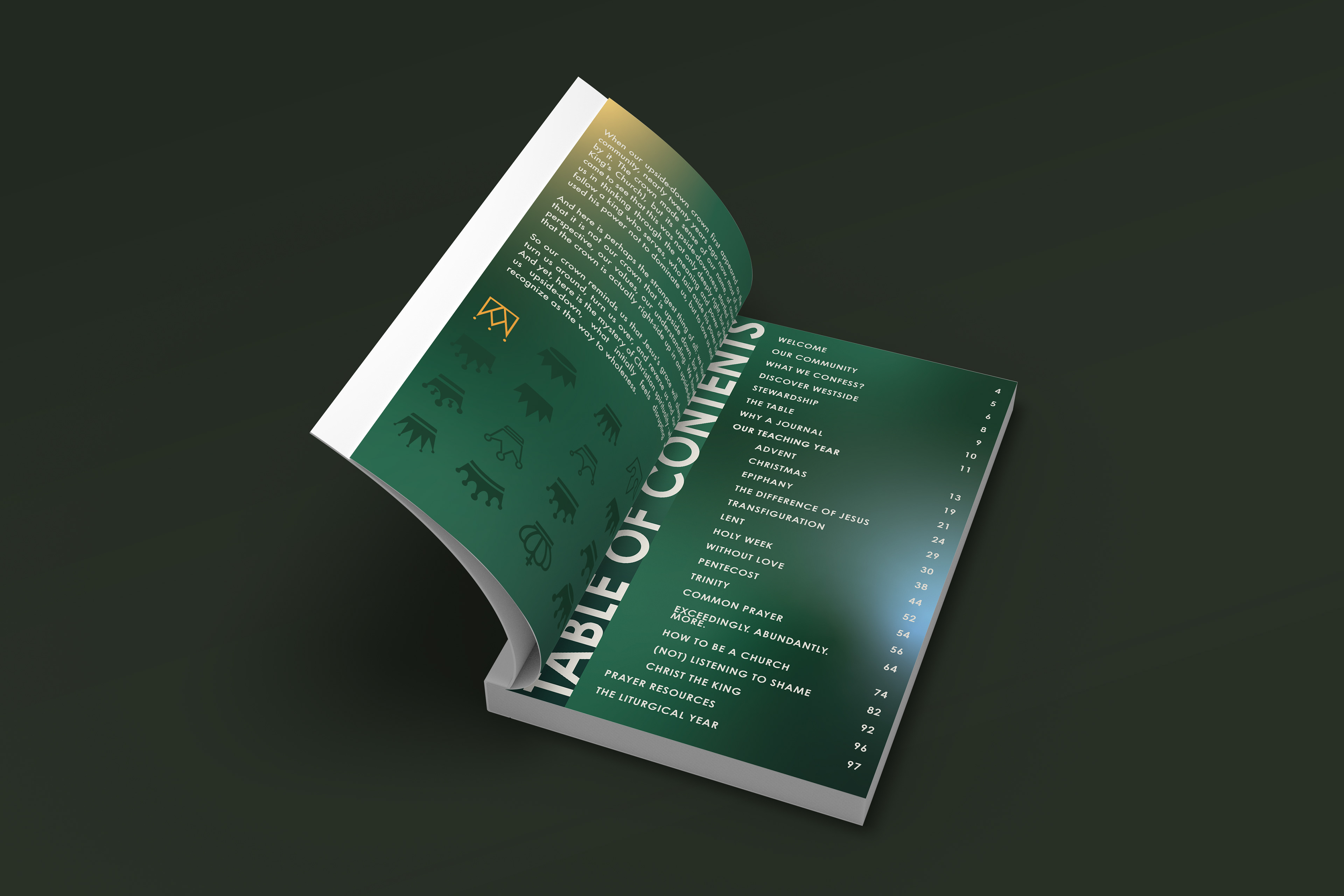
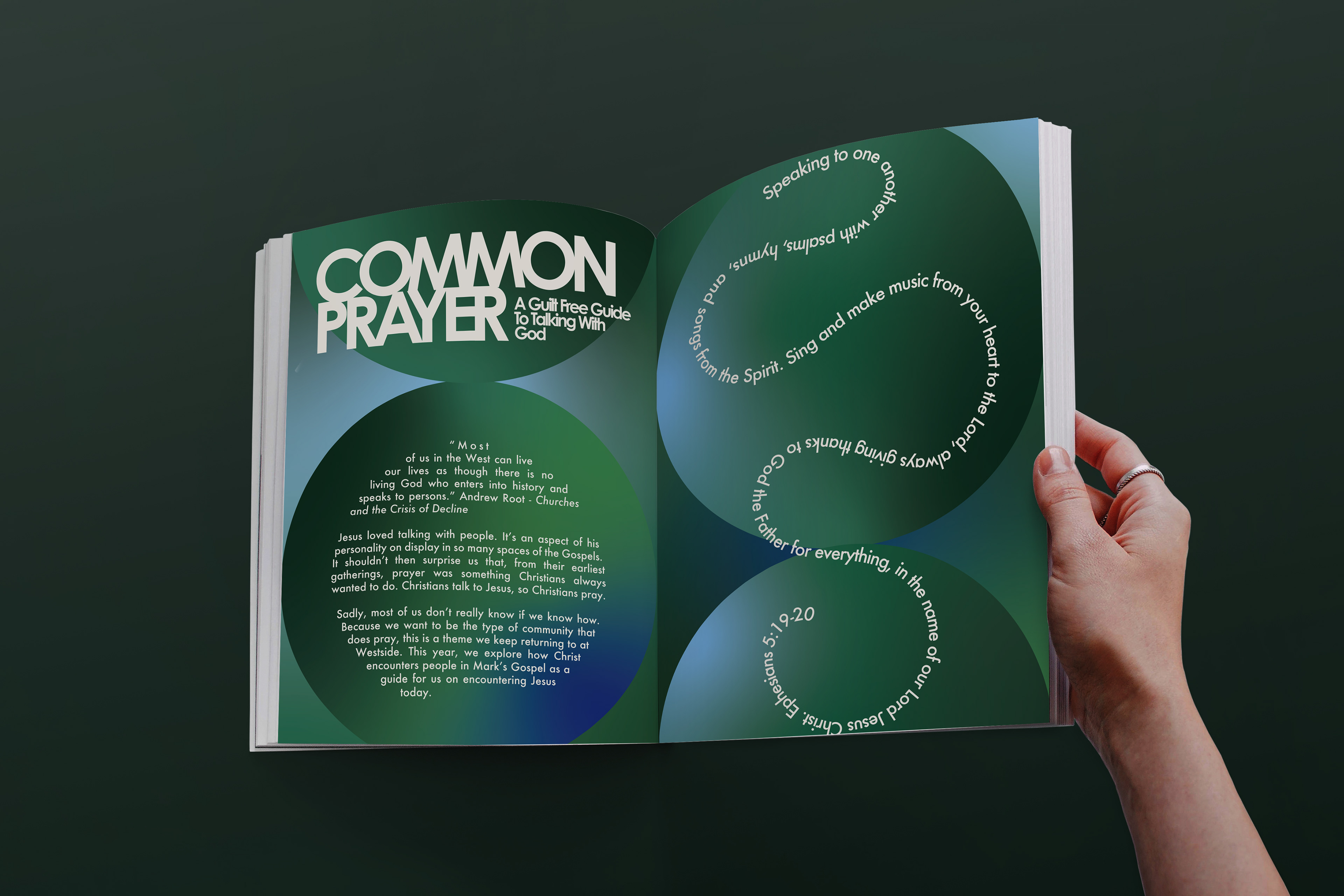
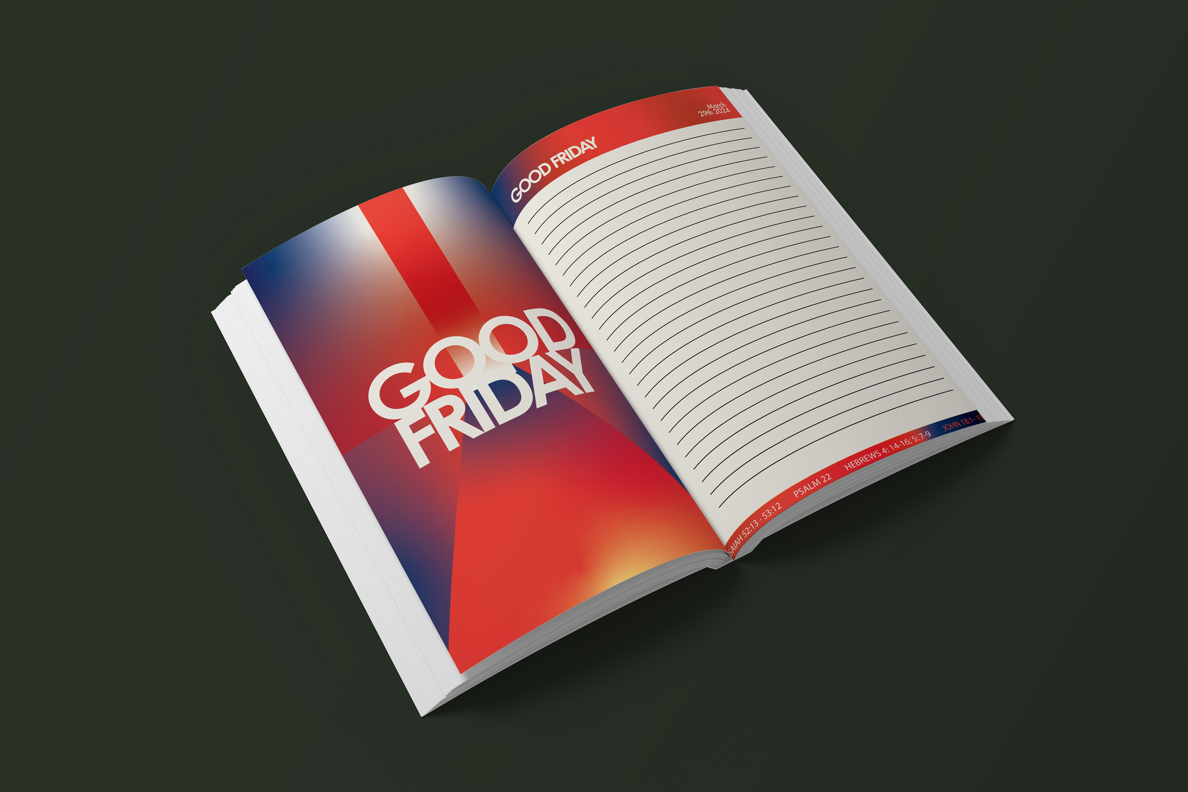
Westside Kings Church has an annual journal project and they were looking for a fresh take to give the journals new life. We sought to bring a deeper visual connection to the ways the church had changed and grown over the past few years. The goal was to use simple forms, abstract but suggestive art, and soft colour transitions to soften the edges of their corporate feeling brand. We wanted to have light breaking through darkness and art breaking through business.
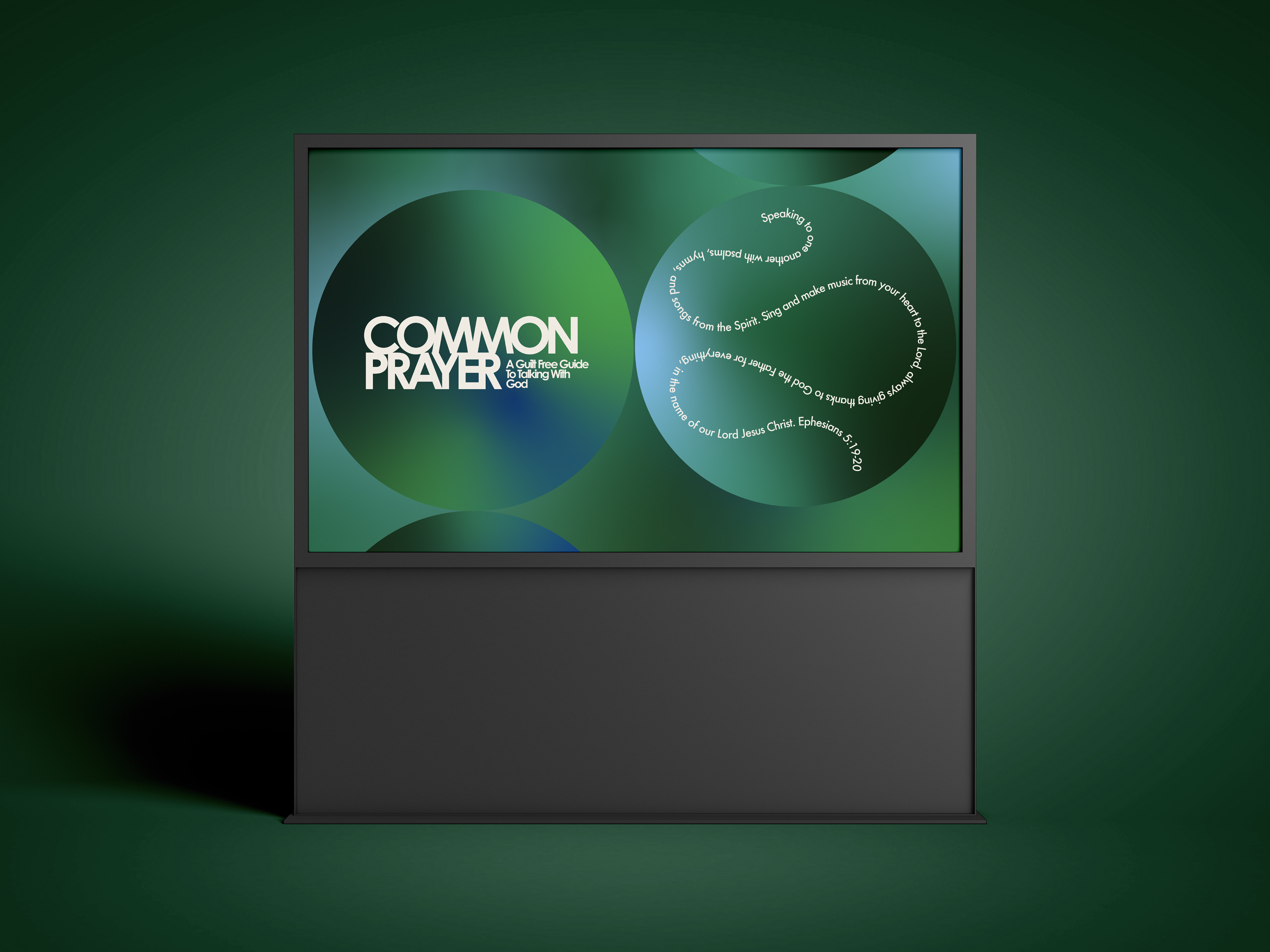
Although Westside is a Pentecostal church they have strong liturgical leanings so we have the colours representing each week match the colour of the stole that will be displayed on the cross in their services as well as bringing the art from the congregant's journals up onto the screens to unify the whole church experience.

