REAGAN McLEAN
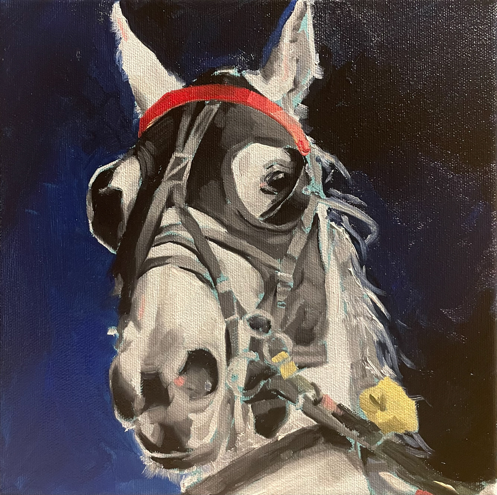
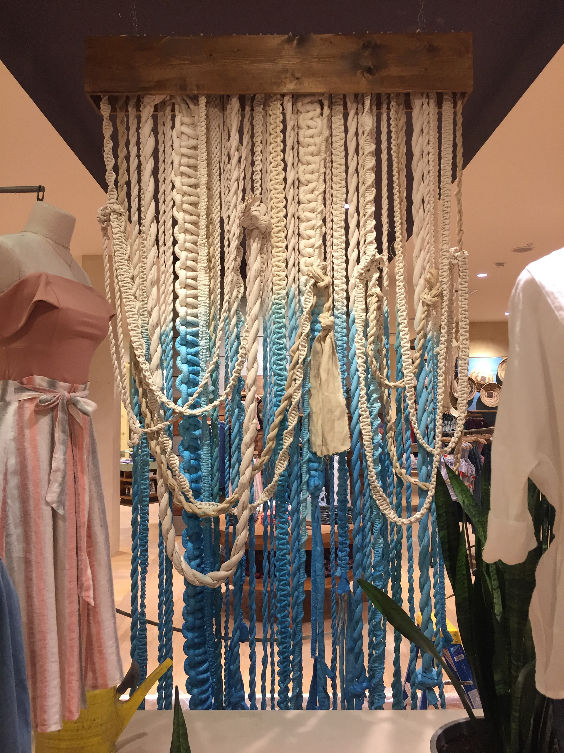
Thank you for taking a look at my portfolio. I am a multidisciplinary designer and artist looking to bring intrigue and charm to brands. I specialize in compelling branding, logo design, and creative direction while exploring new processes and materials for real-life applications. I am very adaptable and love working on both small focused projects, like one-off packaging, as well as large multifaceted projects, like full-scale rebrands, all while ensuring fresh ideas and on-time delivery. Below you will find examples of my work in graphic design, logo work, package design, web design, creative and art direction, and merchandise design as well as various paintings, illustrations, and installations.
Boreal Sons - You & Everyone
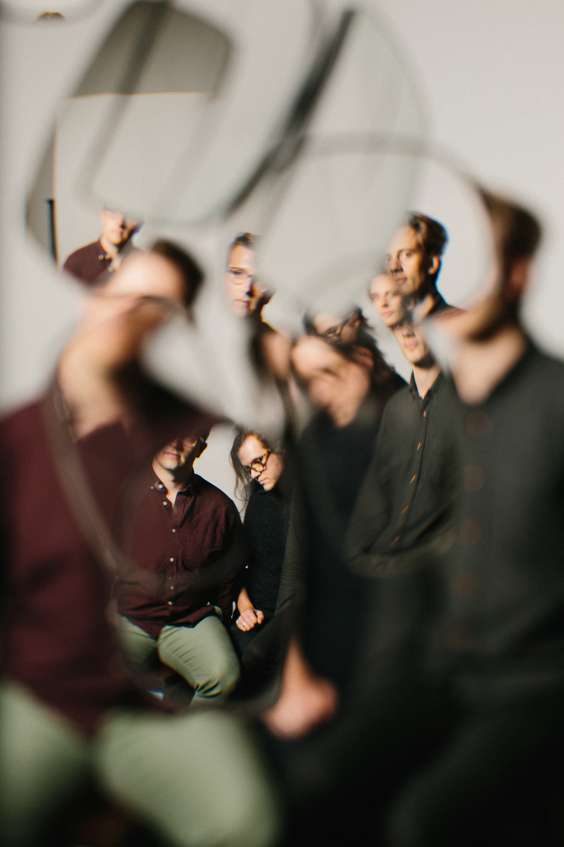
Album Release Package
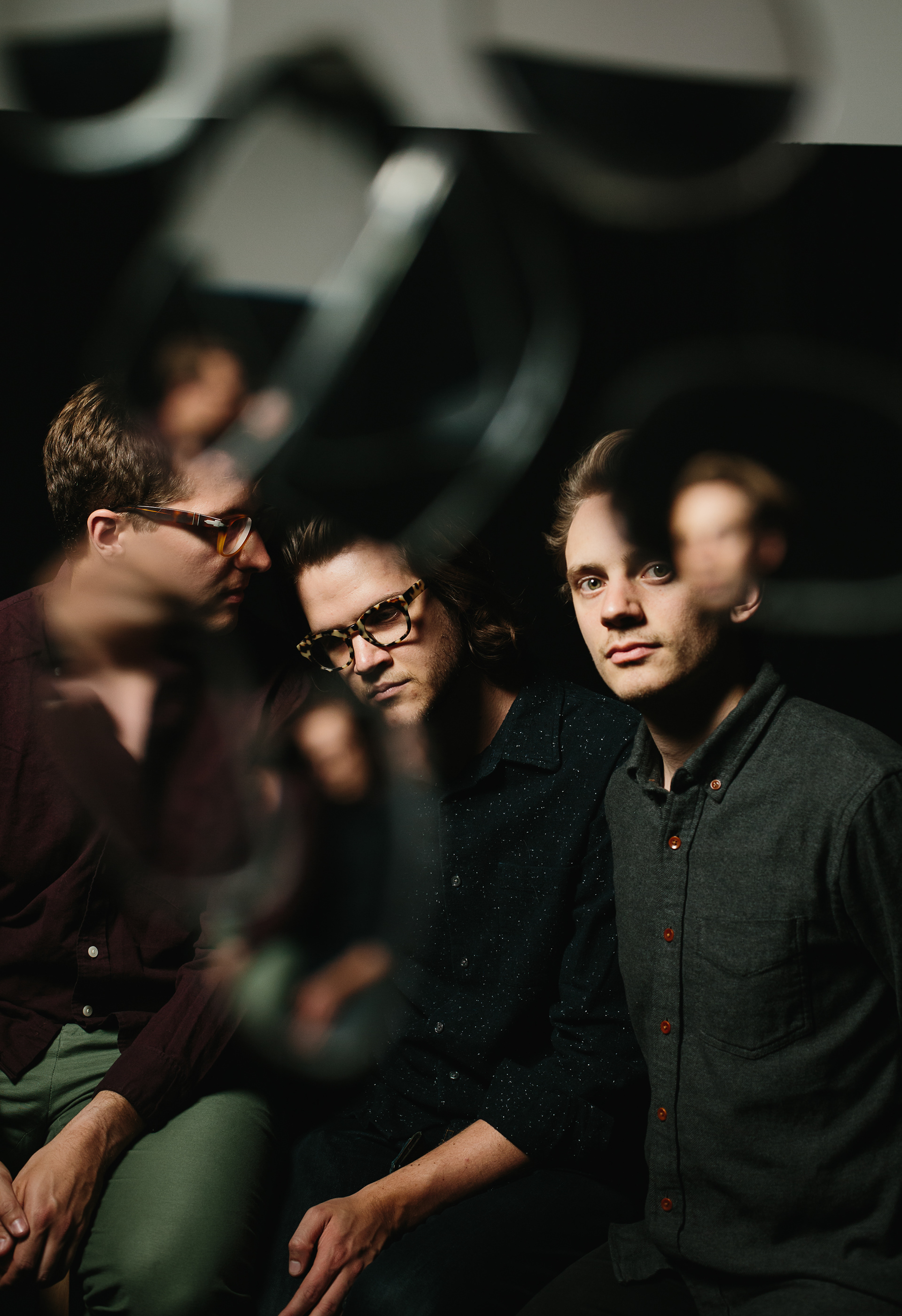
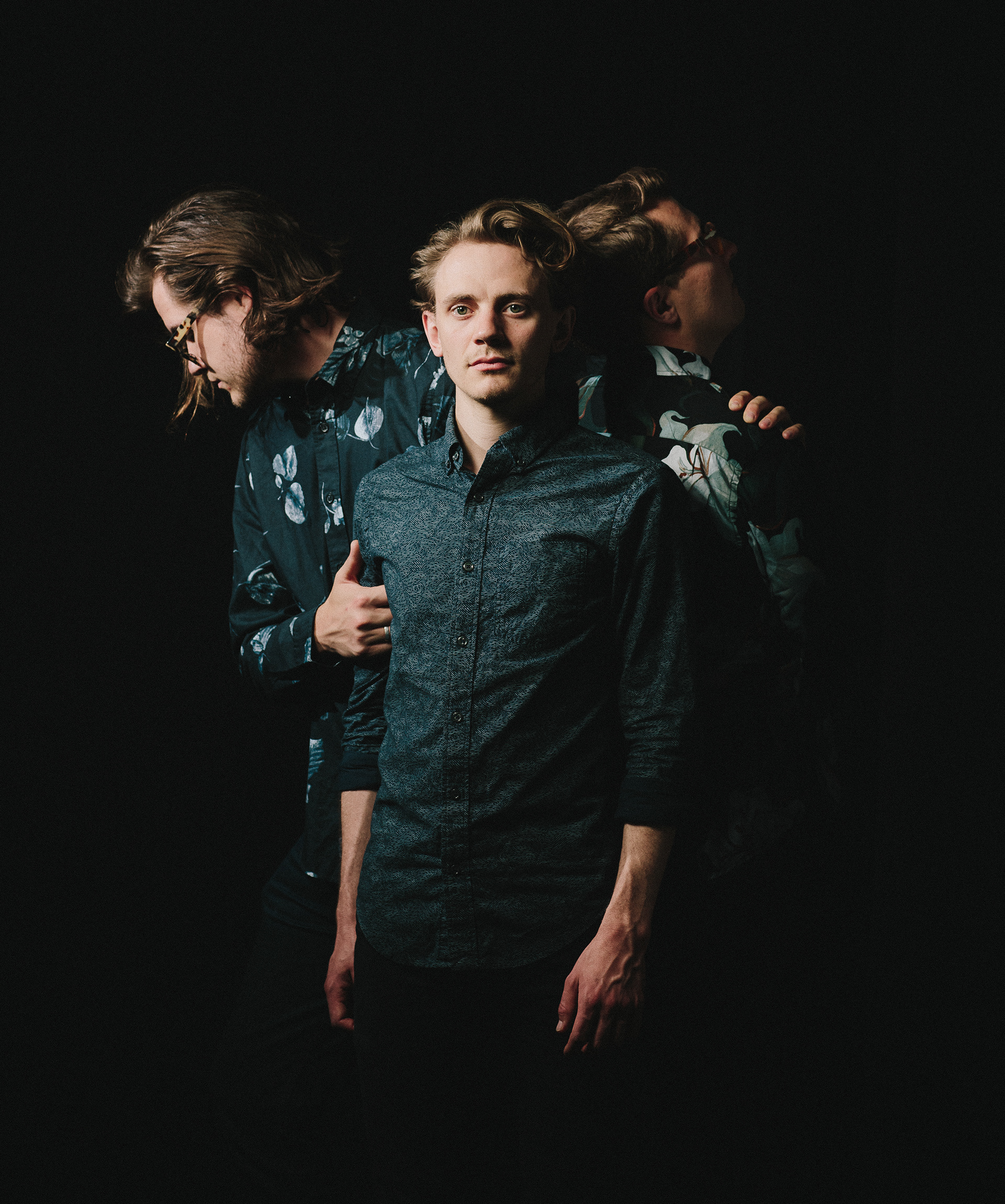
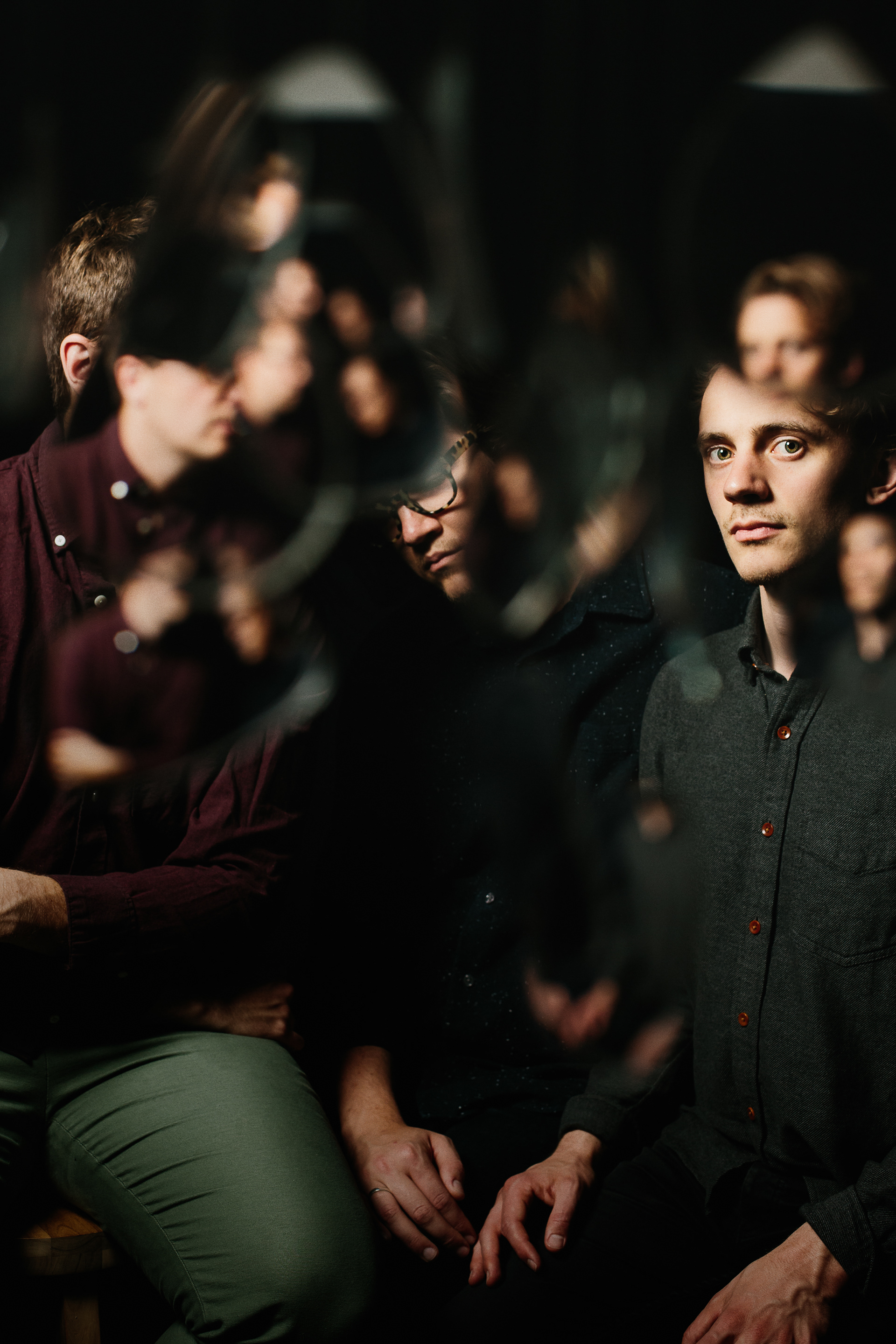
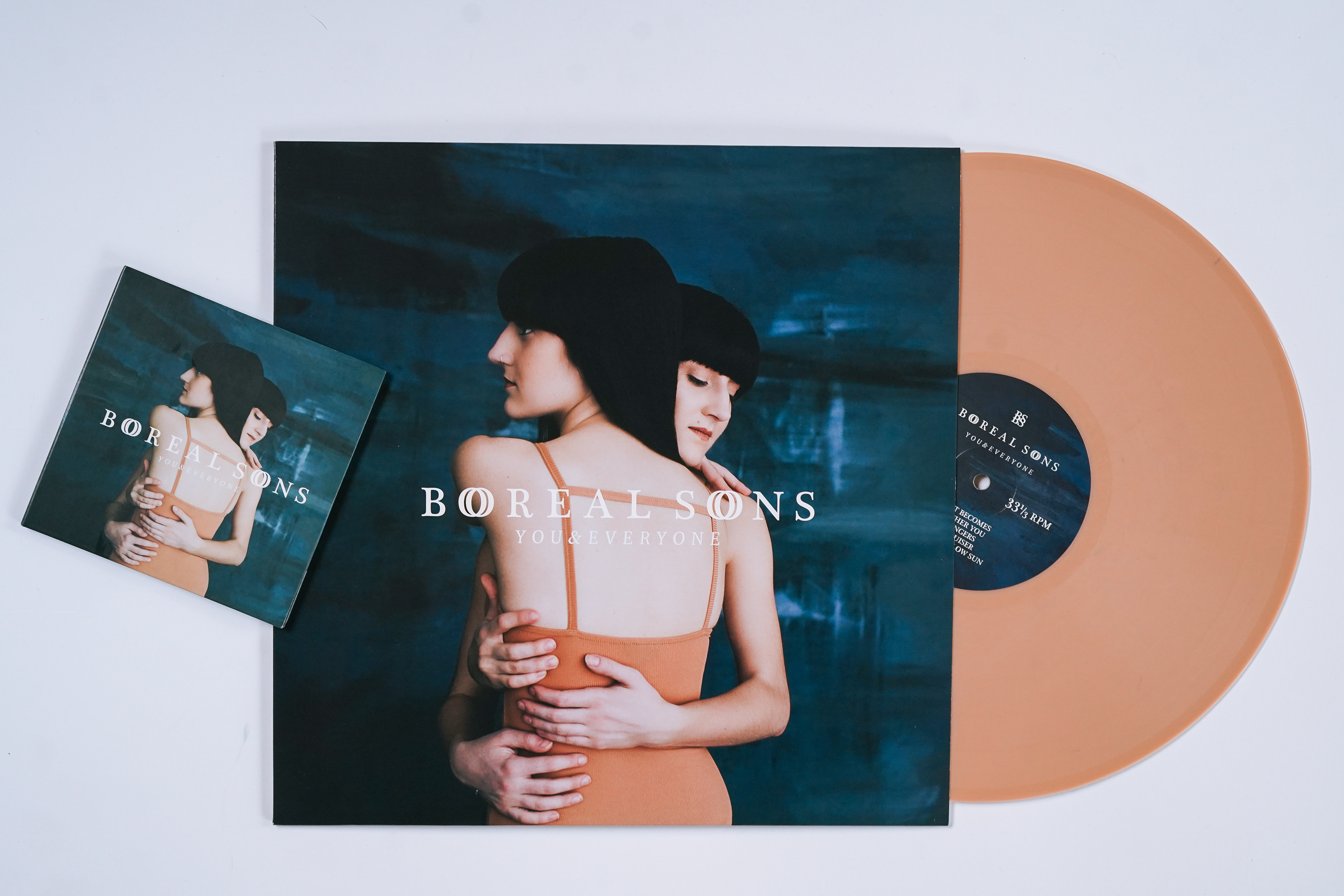
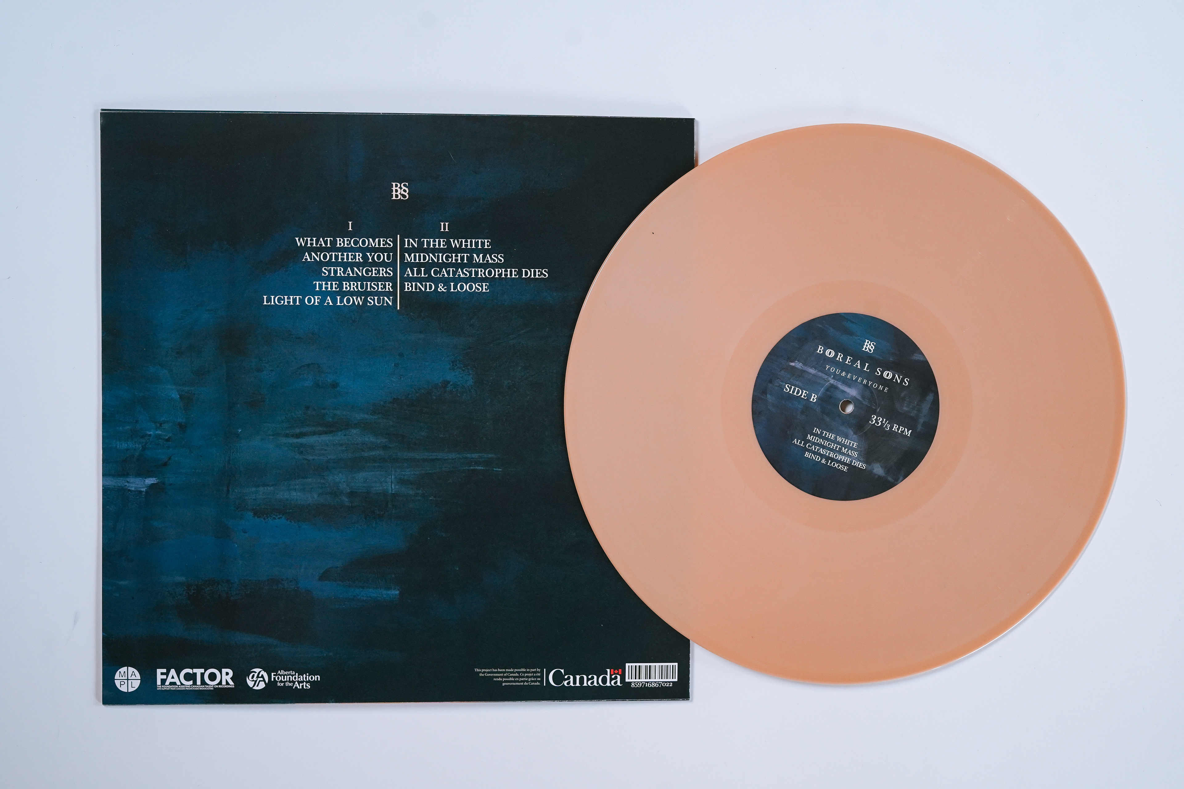
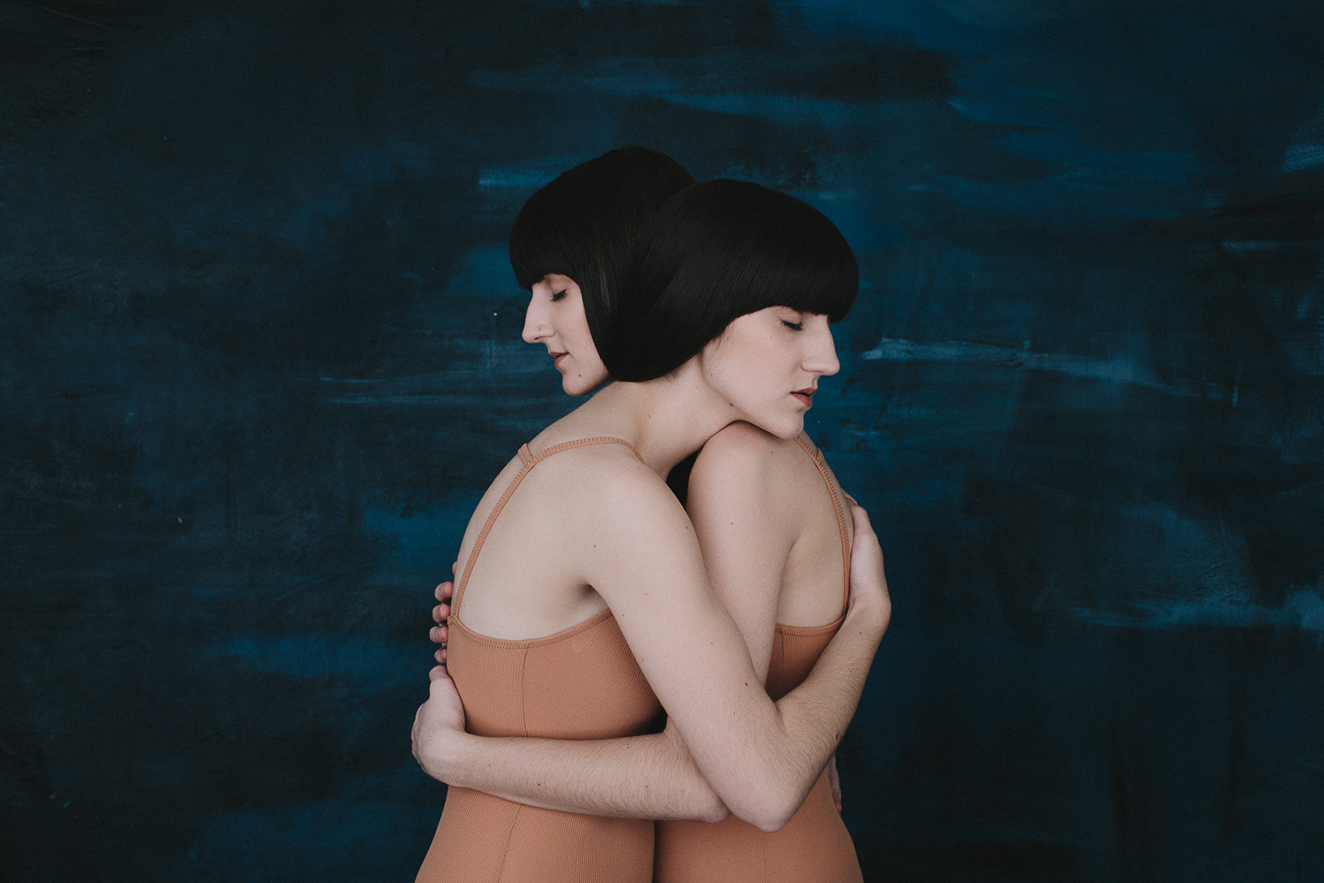
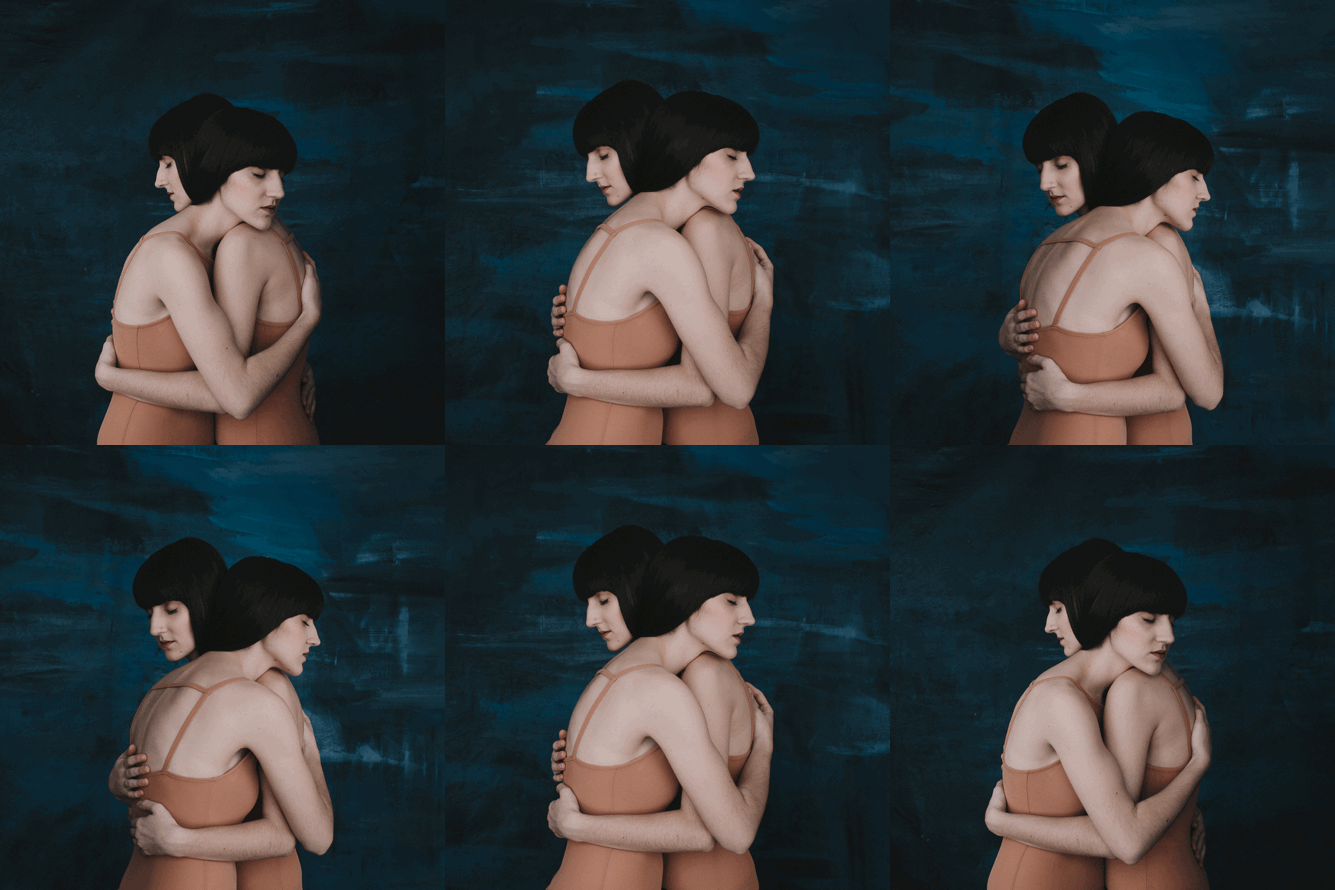
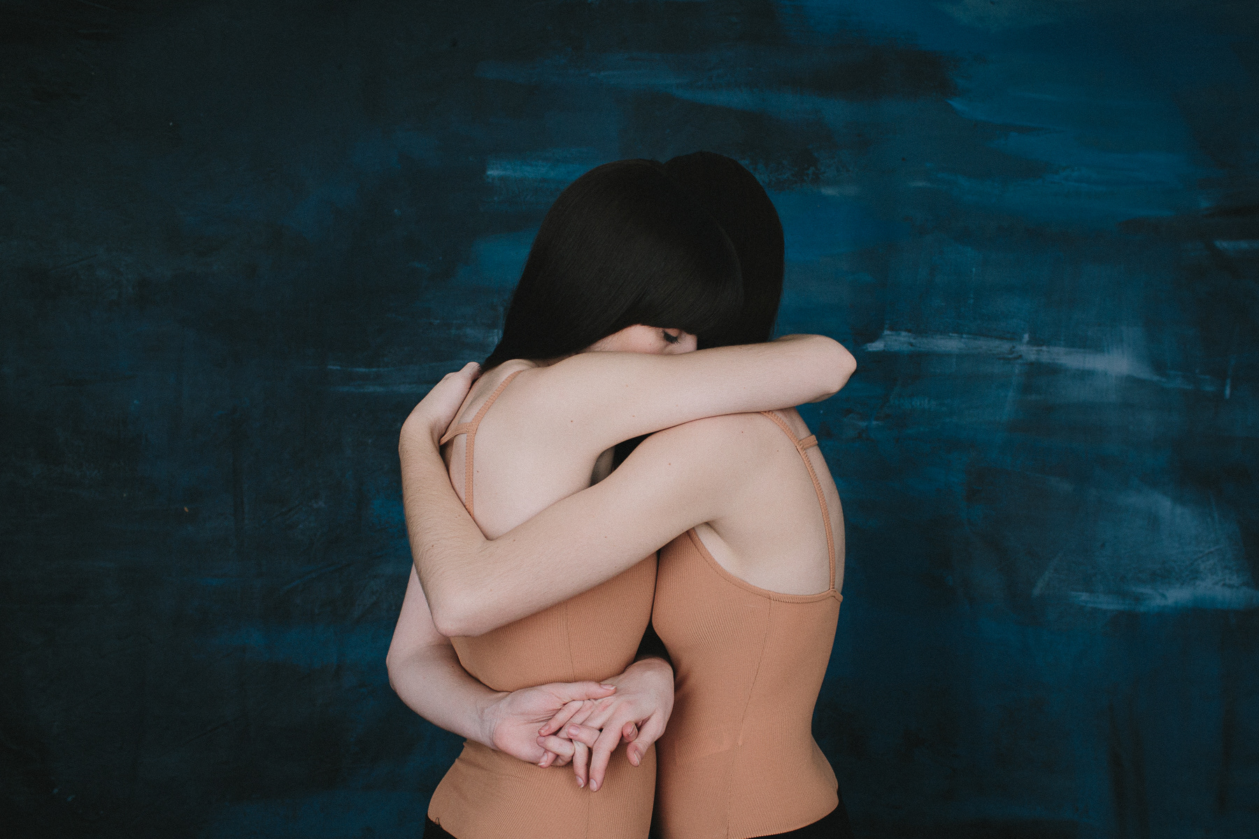
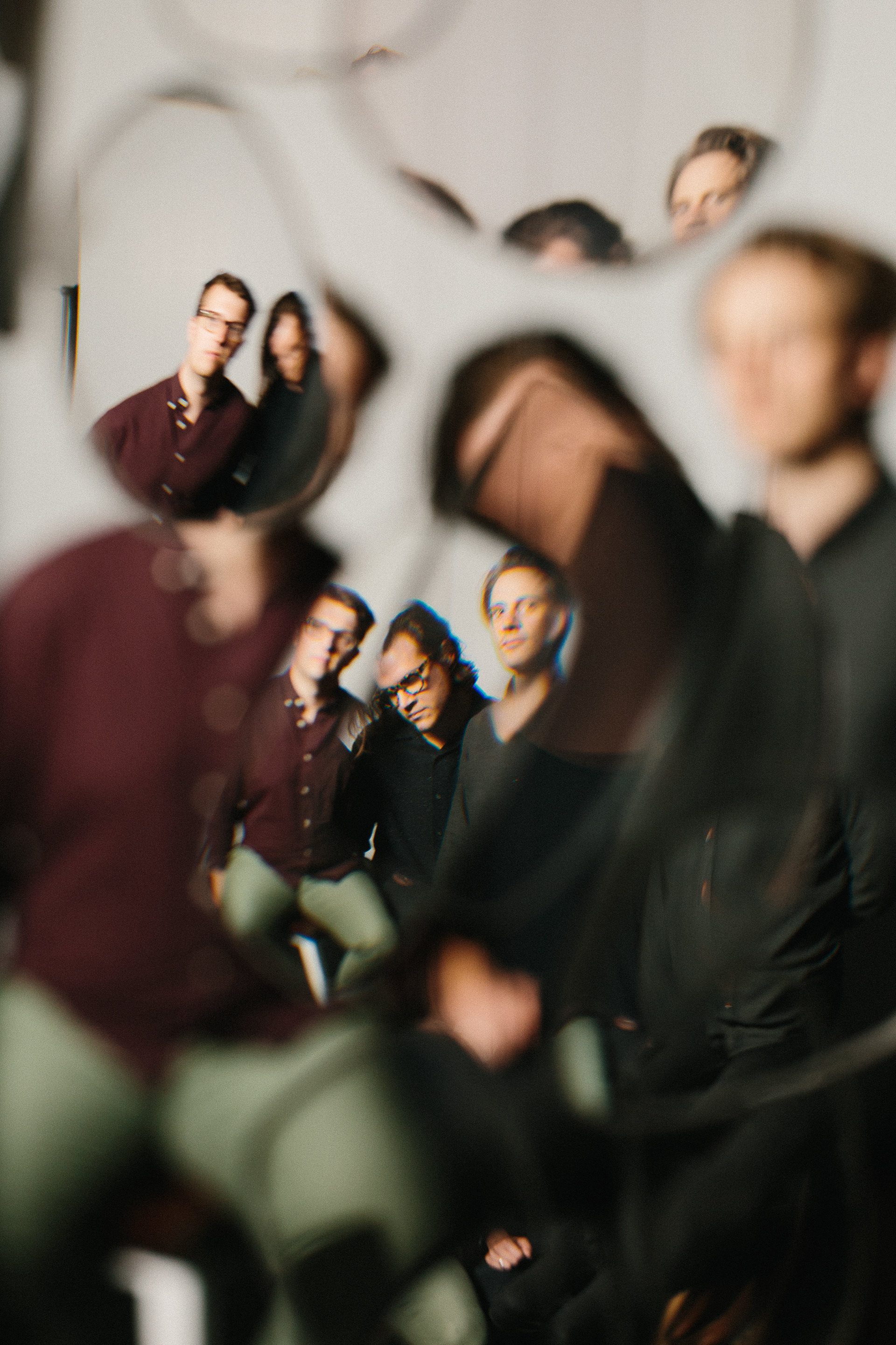
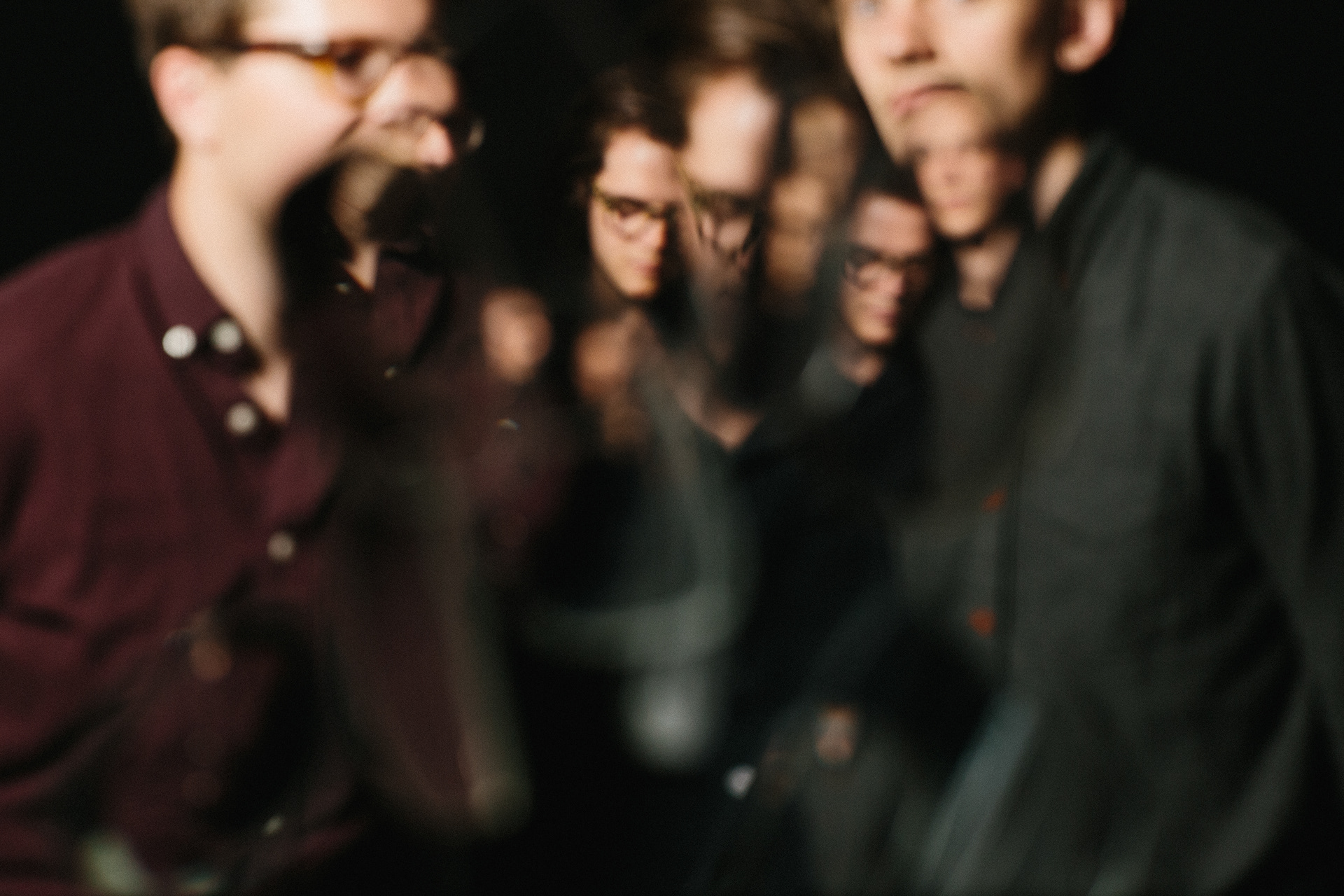
Boreal Sons were looking for a full album release package capturing the ideas for the music of the album in visual forms. The Album attempts to capture the events in our lives that make us feel so unique but are the stories that are repeated in the lives of so many other individuals. Being intimately involved in the project I had a hand in all creative & artistic direction. I partnered with Rachel Pick and Oliver Banyard for album photos and band photography and executed creative direction in studio with both photographers. We used Vintage glasses lenses hanging in front of the camera to communicate the repetition of personal experiences as well as interactive poses to communicate the tension of close relationships. Compared to Boreal Sons' previous release this album contained heavier and darker themes so we decided to give the entire package a bit of a darker and heavier visual feel that presents the band with a bit more reality and a bit less polish.
Monogram Buddies
Custom Packaging
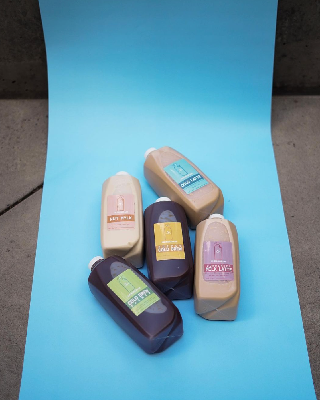
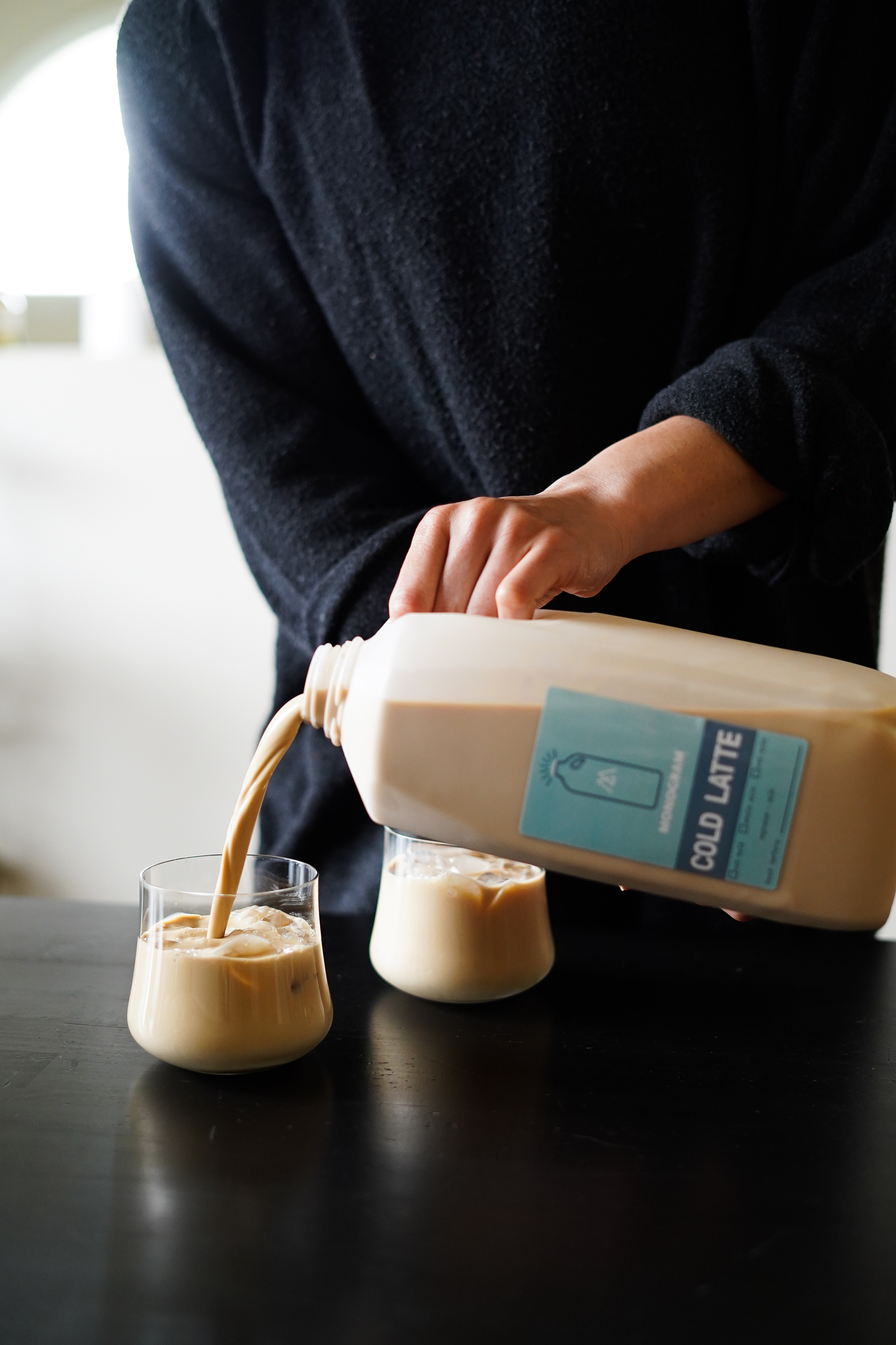
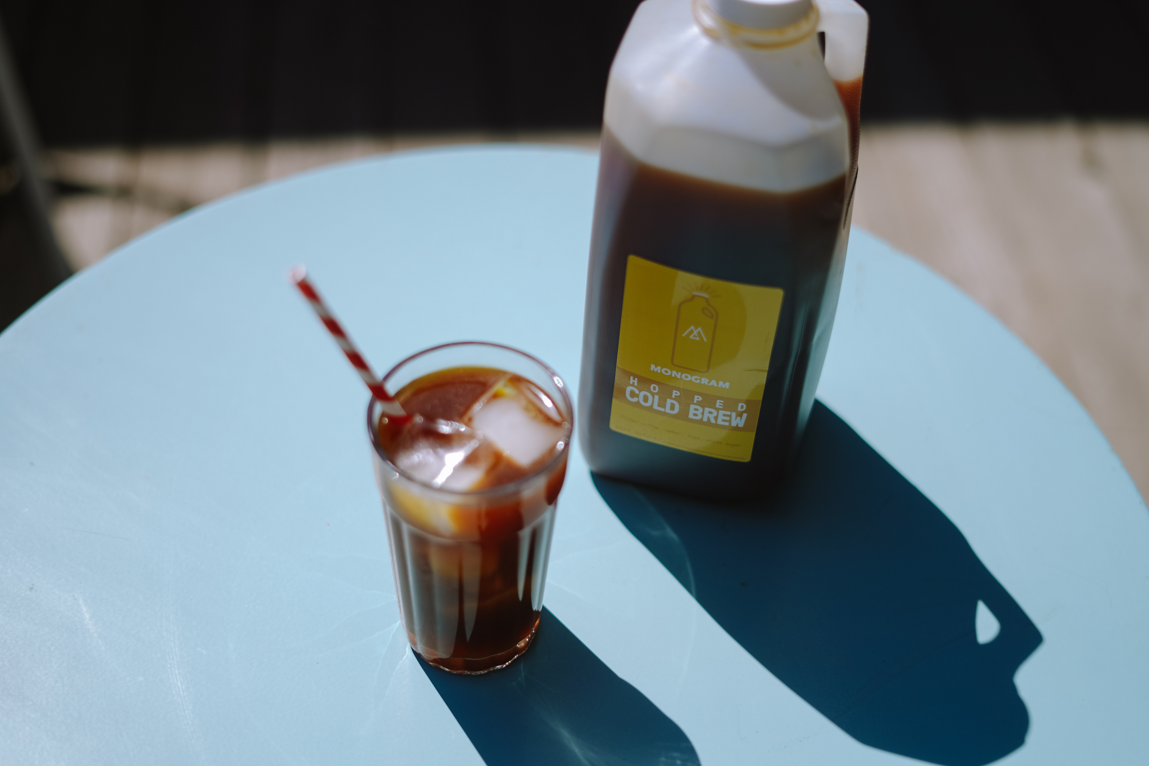
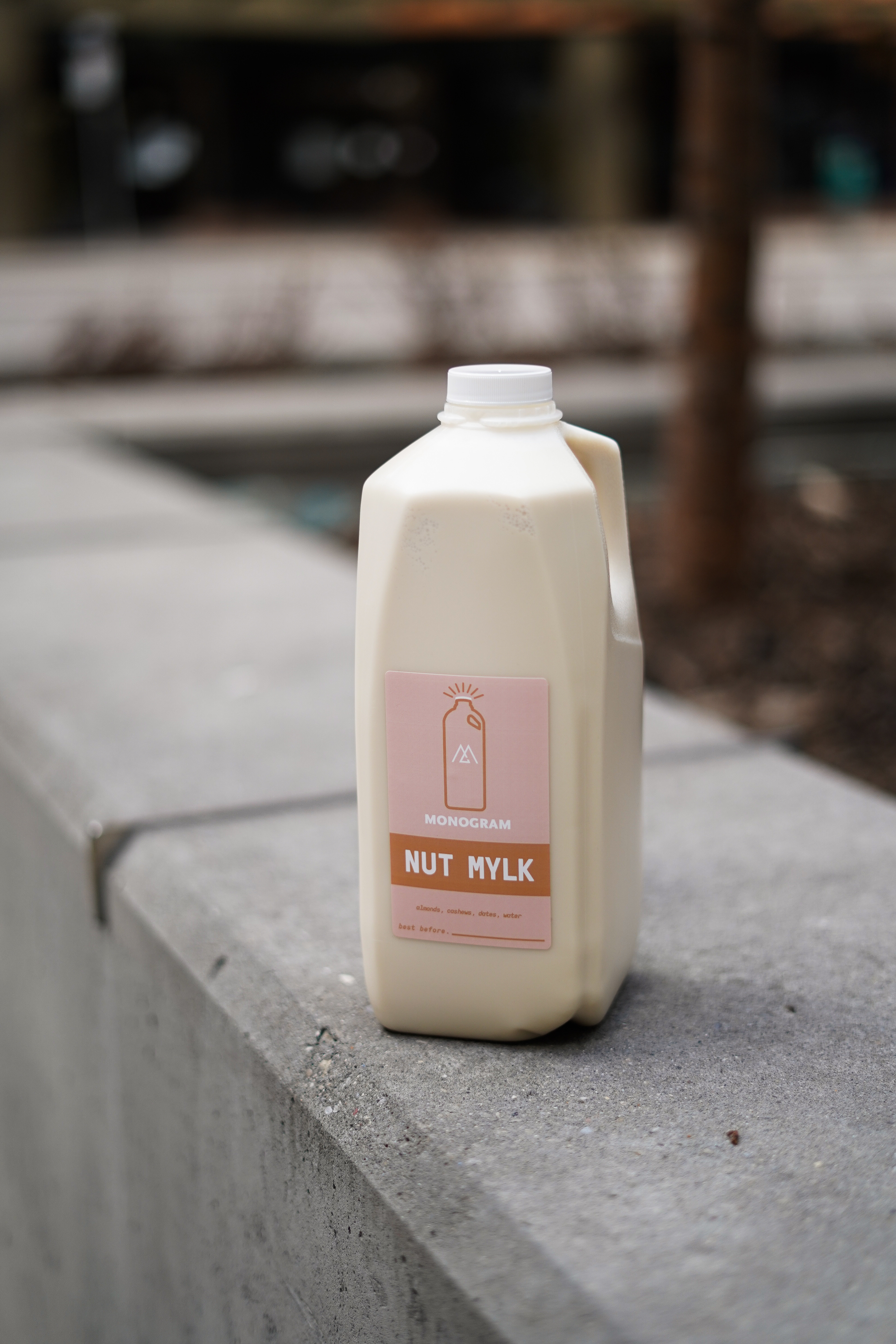
Monogram needed a quick turnaround design for a new way to take home their delicious beverages due to a certain global event that no one wants to talk about. Working within their current brand guidelines I created a charming, light, and enticing series of stickers enabling Monogram to quickly sell their drinks for customers to enjoy at home.
OT Brewing Company
Beer Label Concept
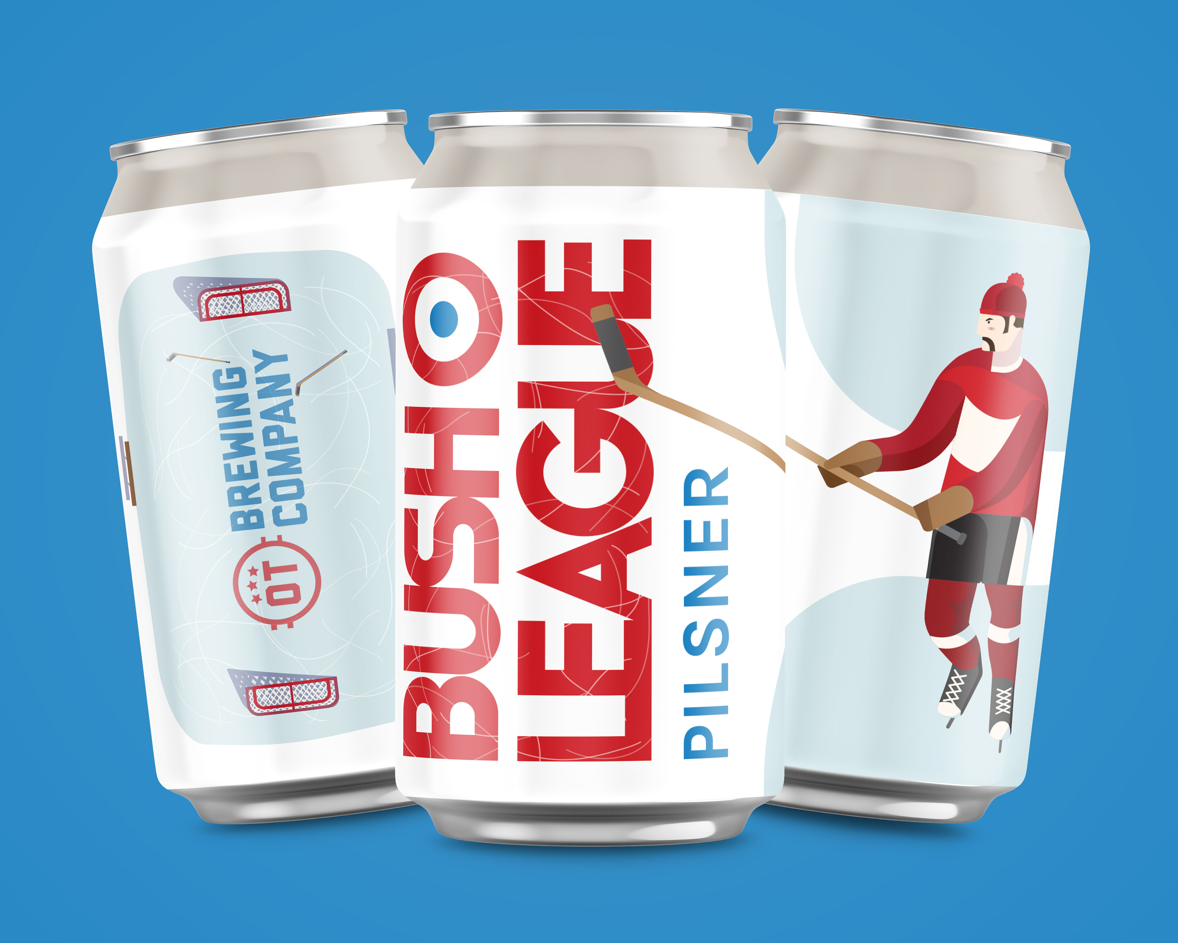
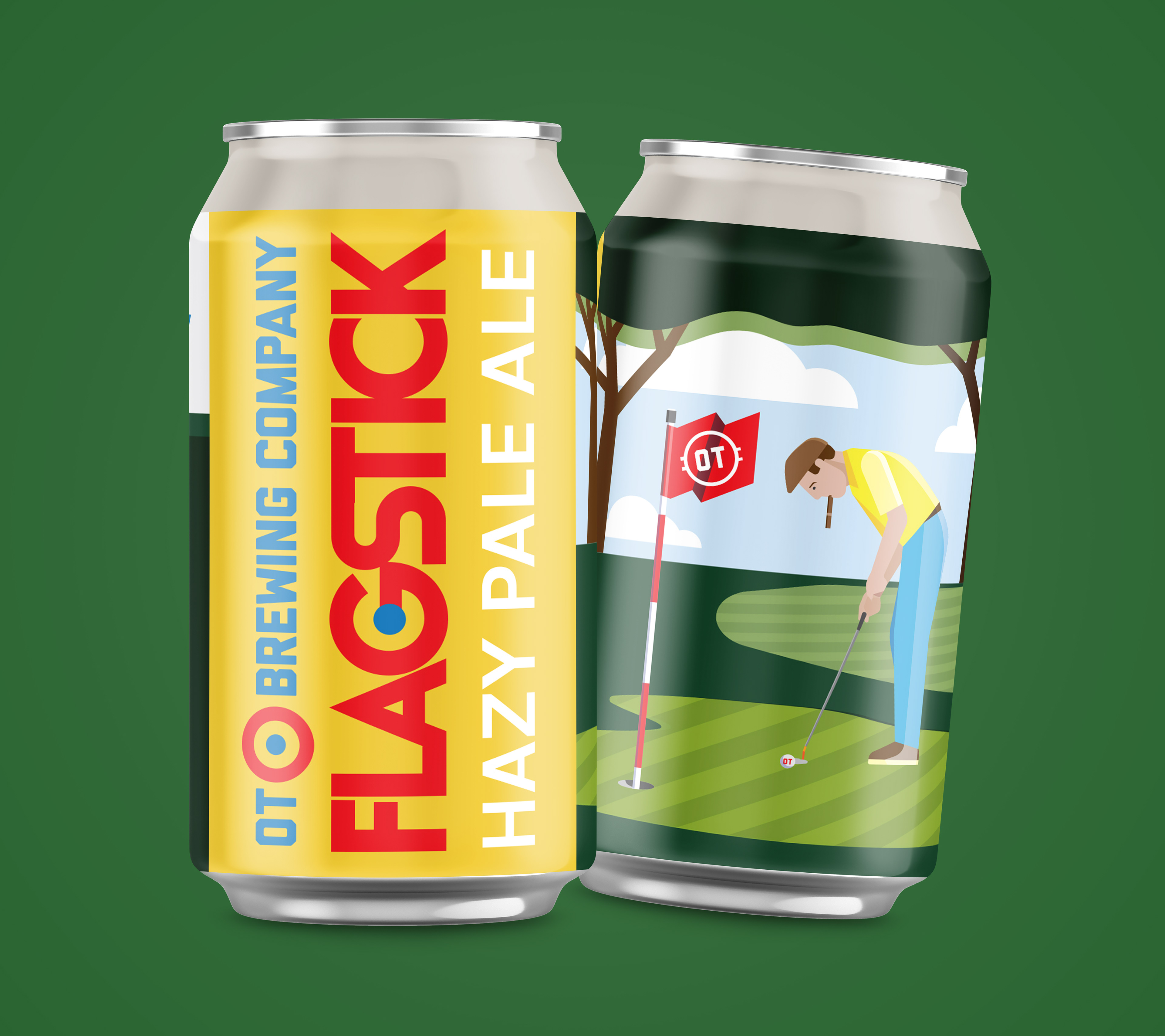
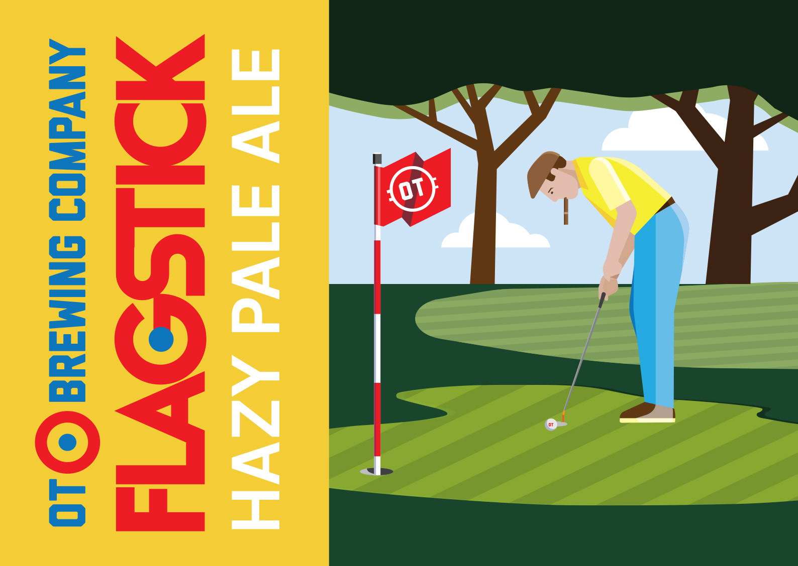
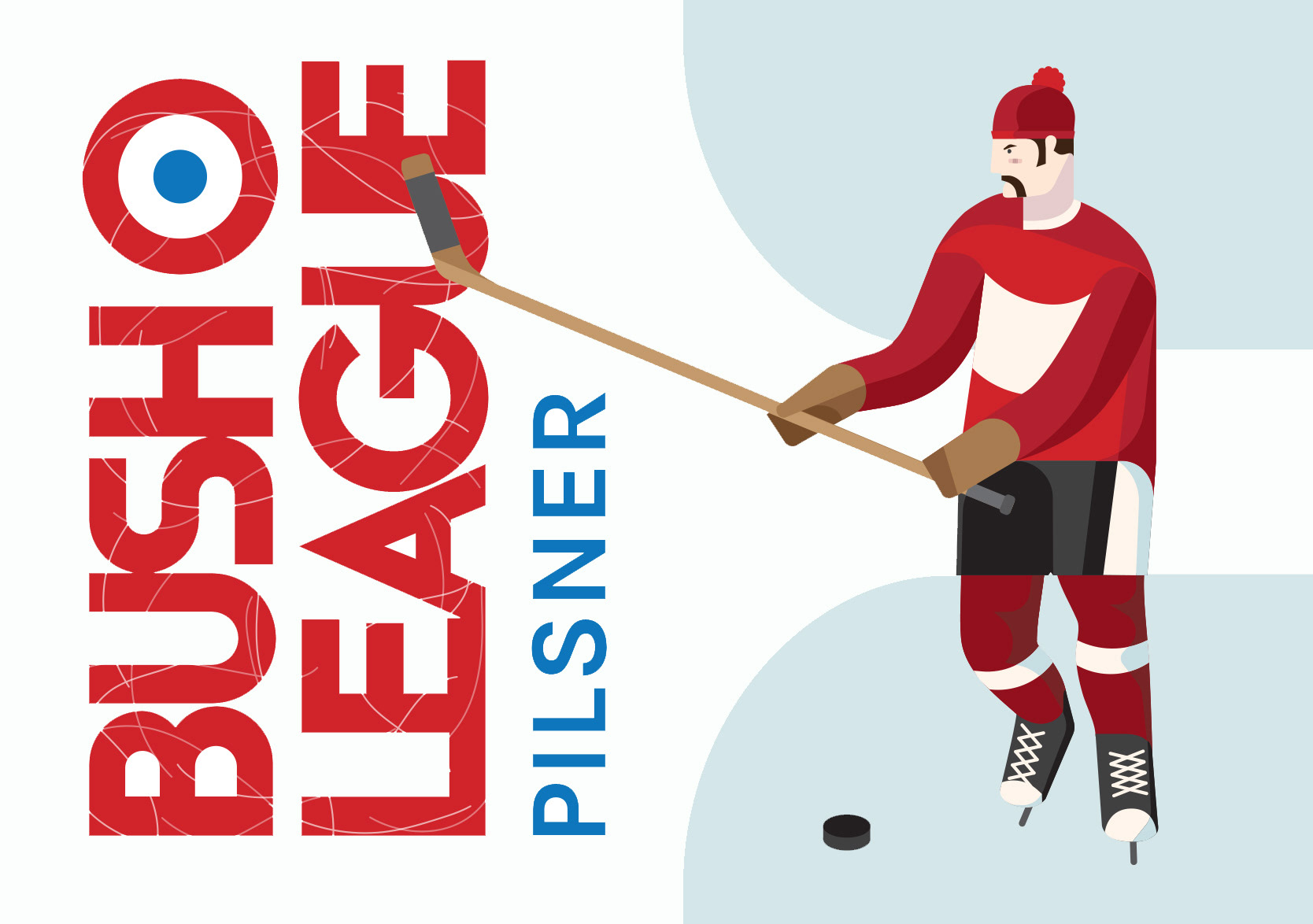
This concept was developed for OT Brewing Company in the early days of the brand's existence. They were looking for a design for their new craft beer that would grab the eyes of avid craft beer connoisseurs while still speaking to the sports-obsessed beer drinkers that we all know and love. I was able to create bespoke geometric illustrations for multiple sports and while OT eventually decided to go in a different direction the designs and illustrations are still some of my favourites.
Sunday Drinker
Cocktail Blog
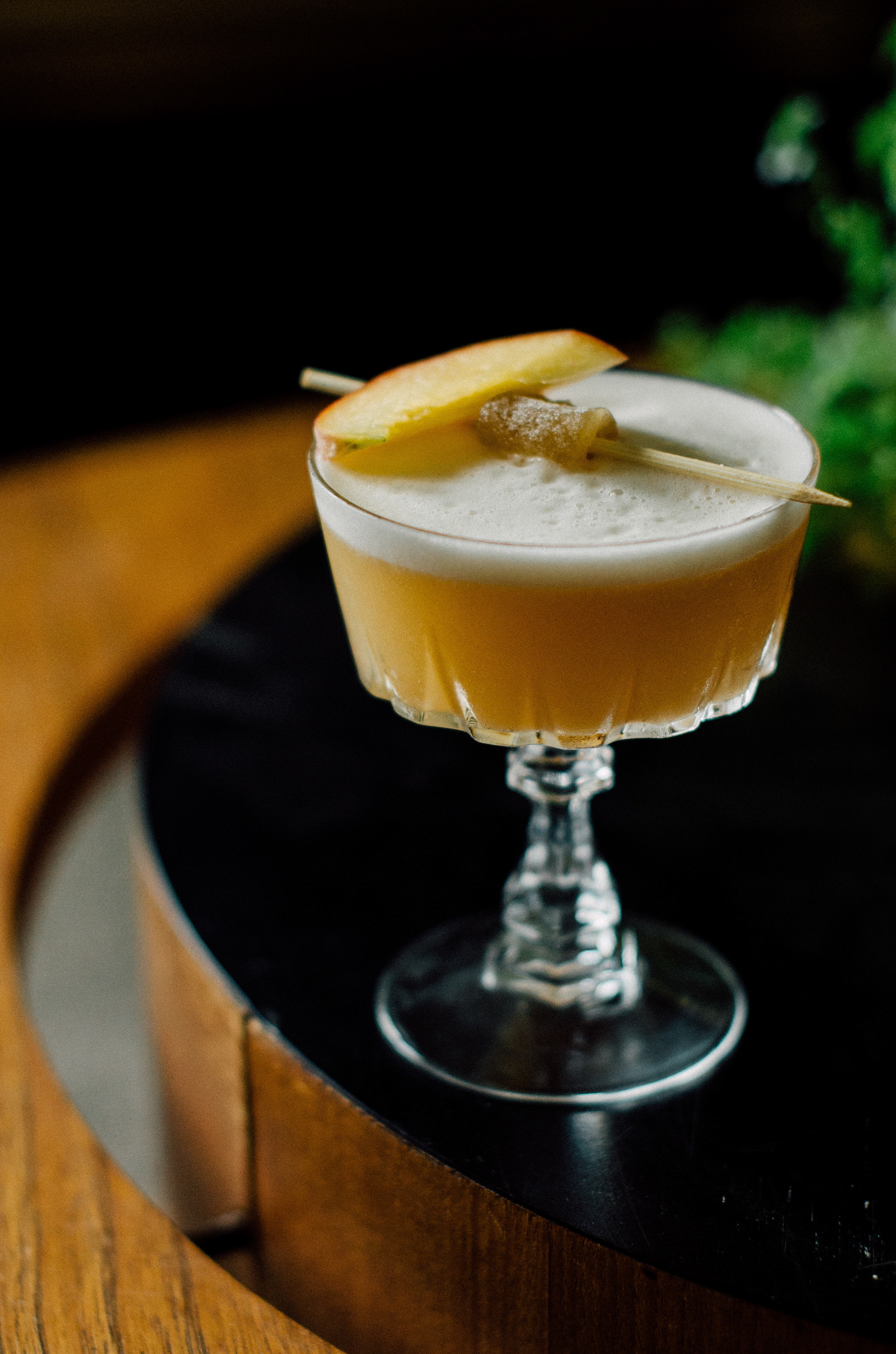
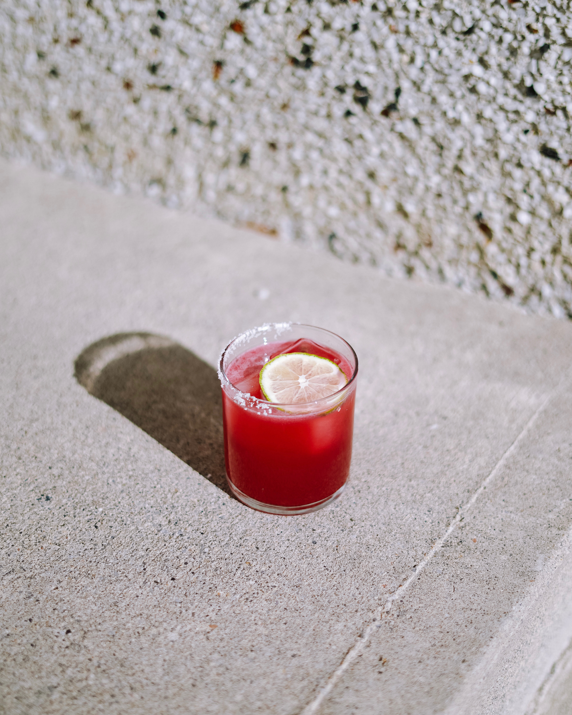
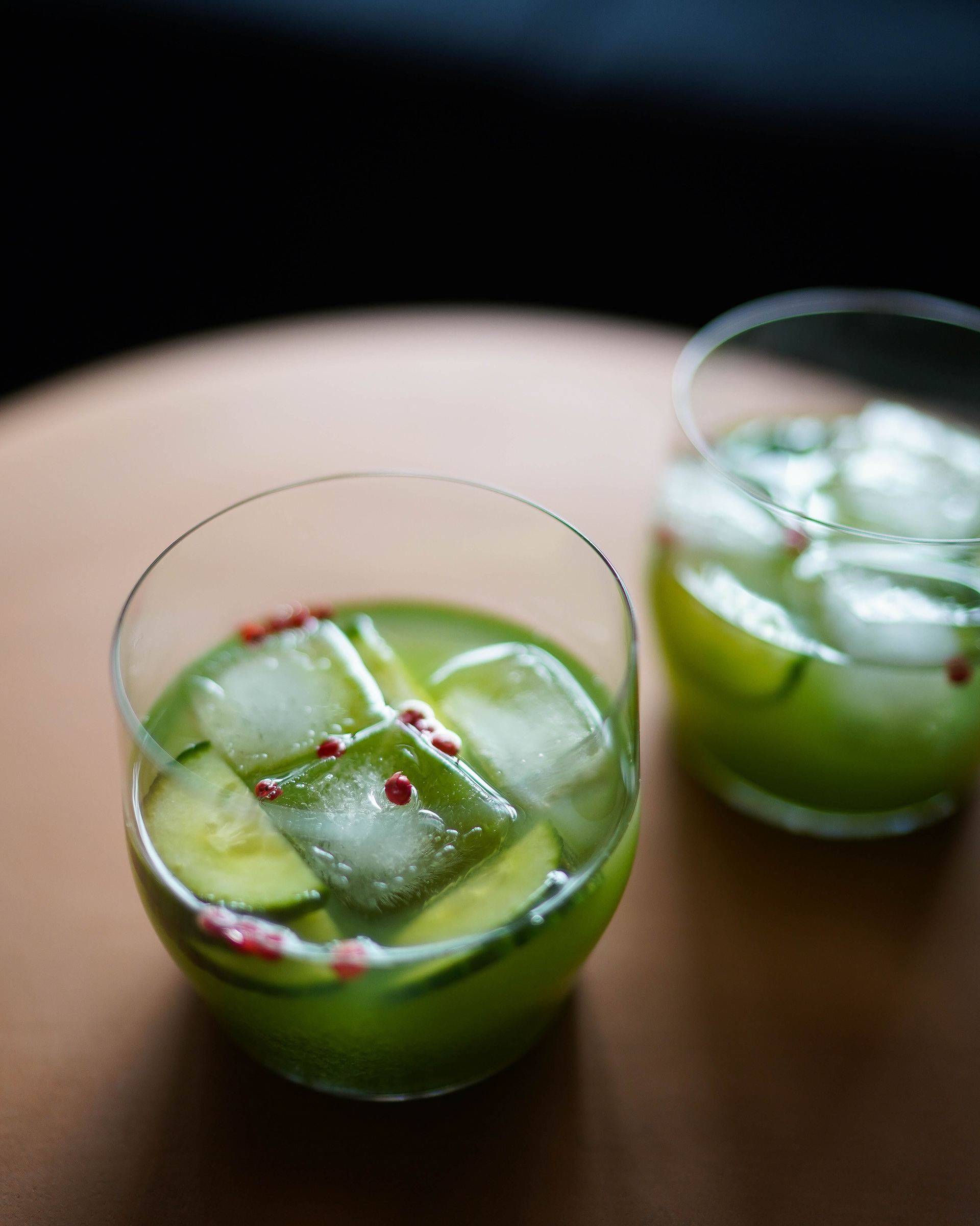
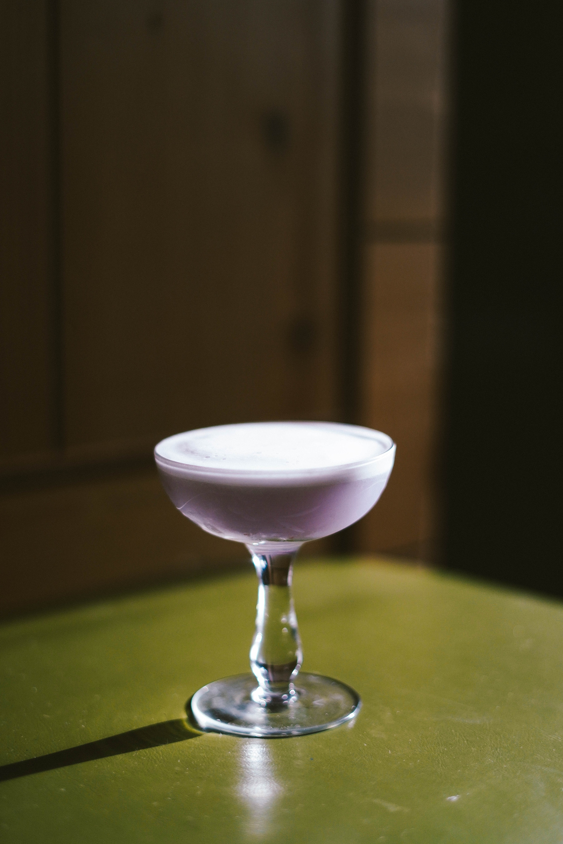
Sunday Drinker was a cocktail blog/passion project for a talented cocktail maker and photographer. Her cocktails were dark and booze-forward with an effortless blend of flavours. The small illustrations and branding were designed to carry a sophisticated edge while leaving room for a bit of fun and playfulness because how serious can a cocktail blog be!? The brand needed many ways to be recognized whether it was the main logo, sub-logo, illustrative stamp or just colour palate (not to mention opportunities for some killer merch)
Monogram Apparel
Lets make it a long sleeve
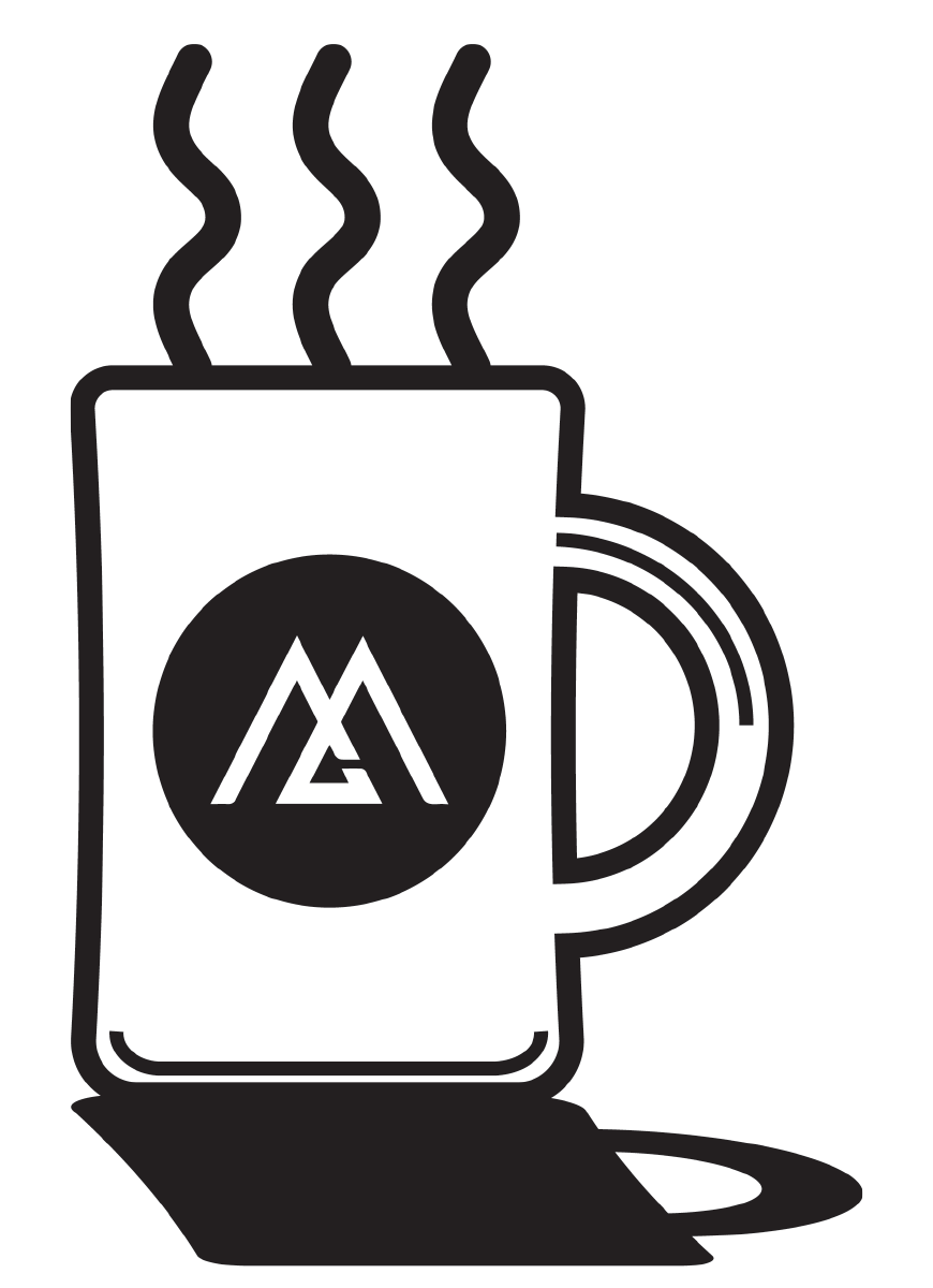
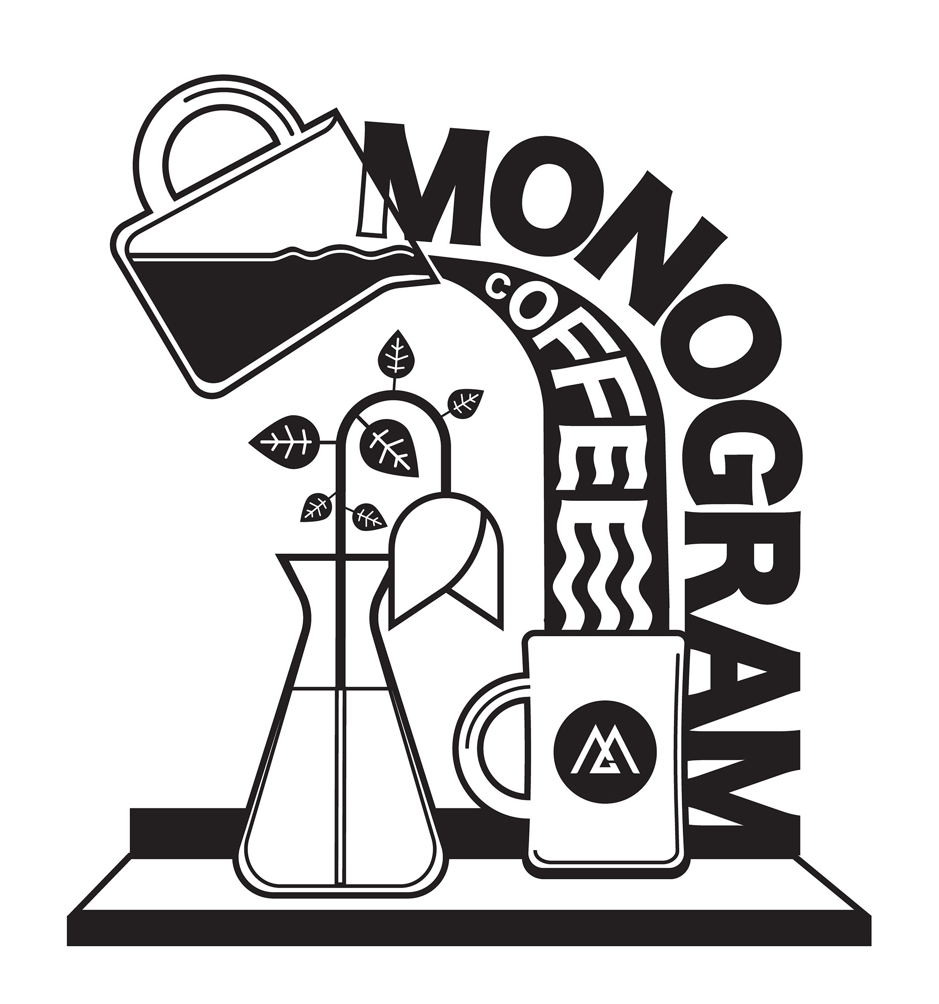
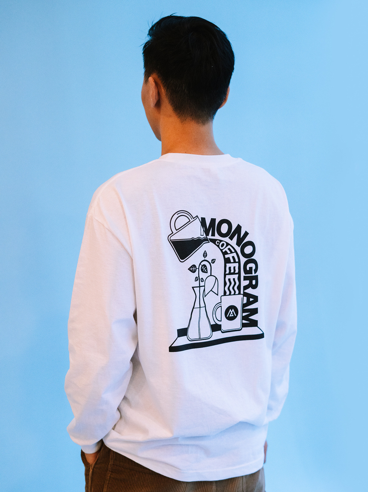

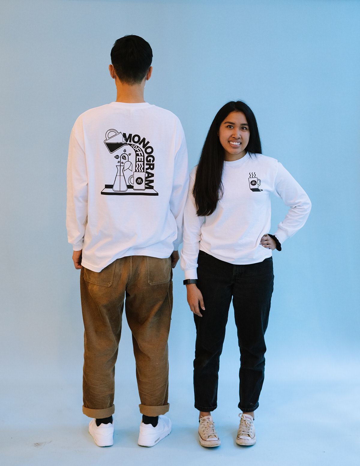
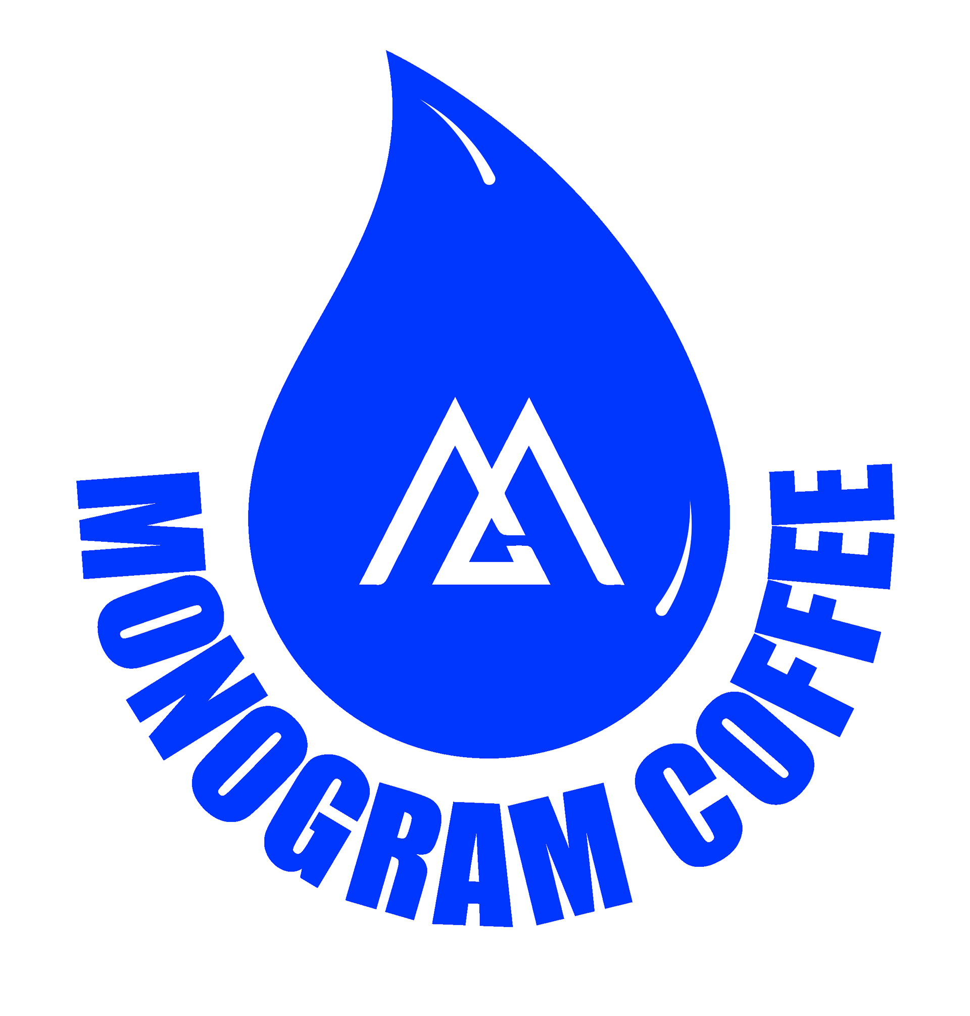
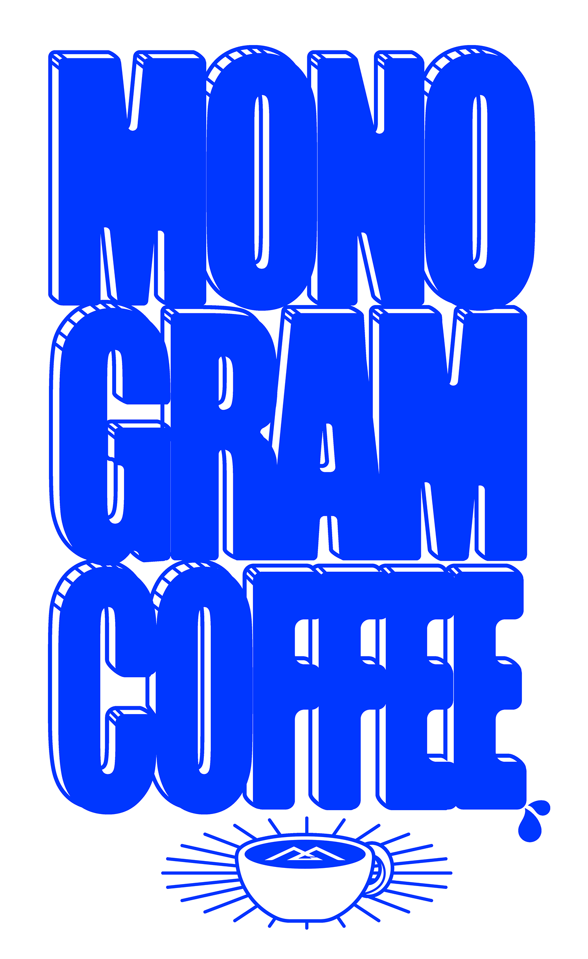
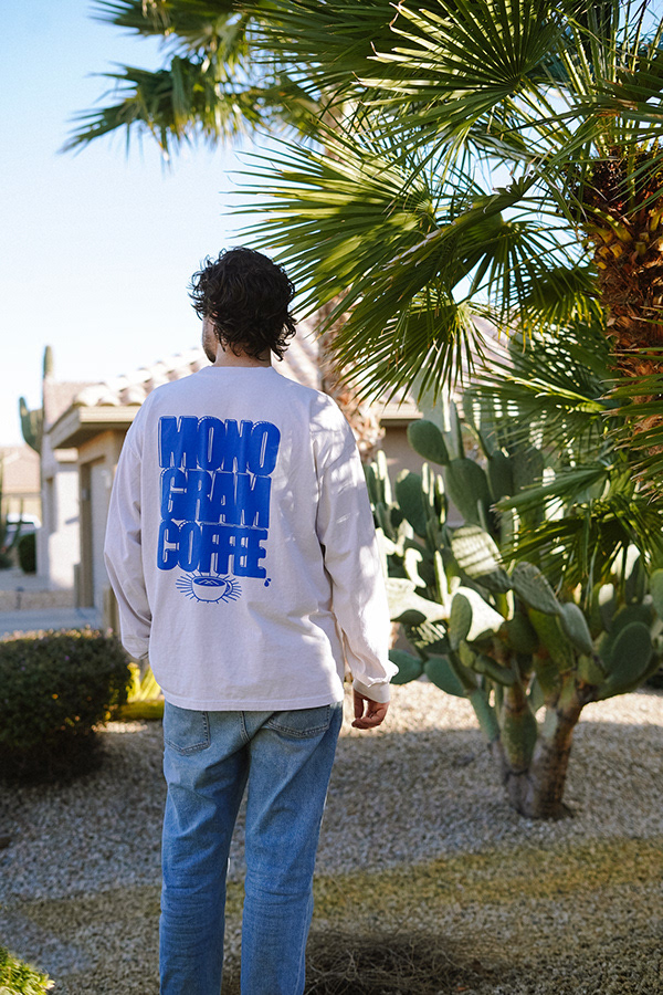
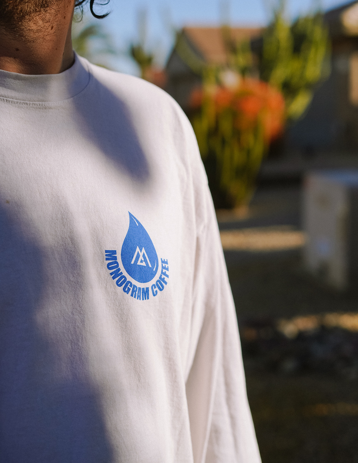
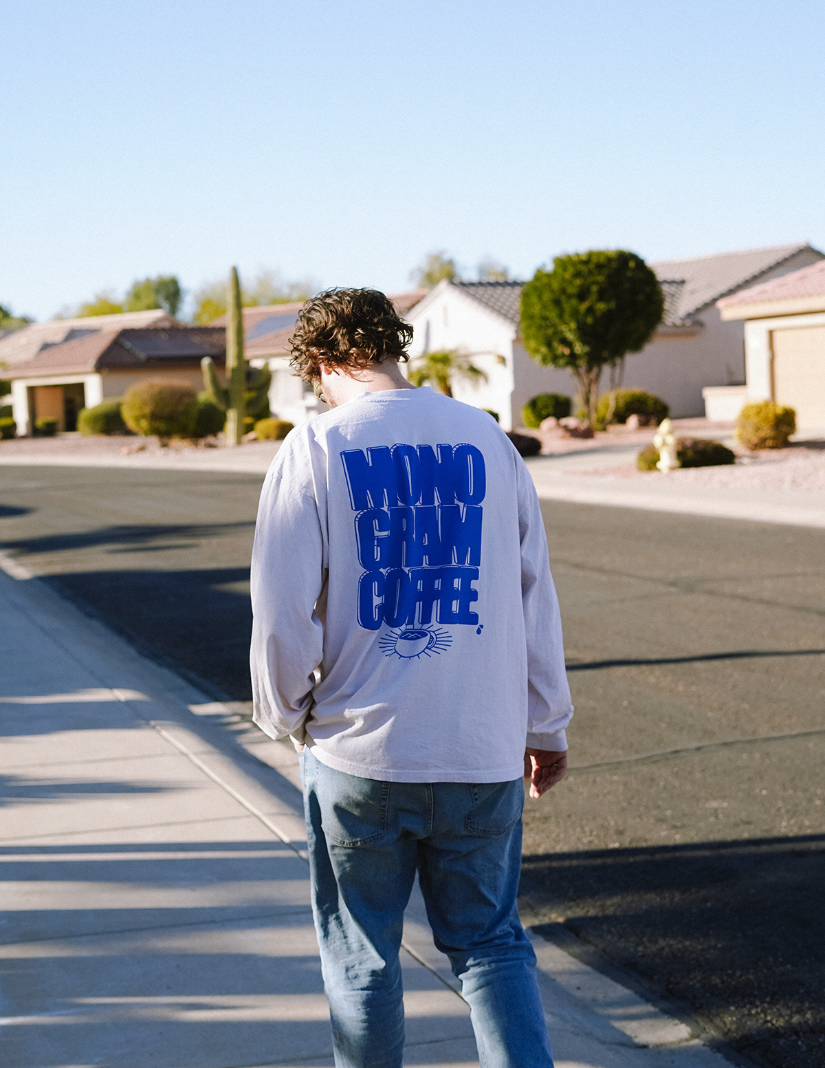
Make it coffee but not too coffee. Monogram is a brand that I always want to rep and when they came to me looking for a long sleeve I was excited to give them a product that would feel as cool as their brand. Coffee brands tend to put only coffee gear on their shirts so we wanted to make it cool but not too stereotypical coffee industry swag. For the first shirt, we went for a basic black-and-white design with some fun typography and cute steam wiggles targeting a slightly younger demographic. The success of this first design led to another wacky electric blue design (also on a long sleeve) embracing stretching the brand vibes a bit and again leaning away from stereotypical coffee swag and more toward fashionable streetwear.
Scenic Route to Alaska
Album Cover design and hand stitched Typography
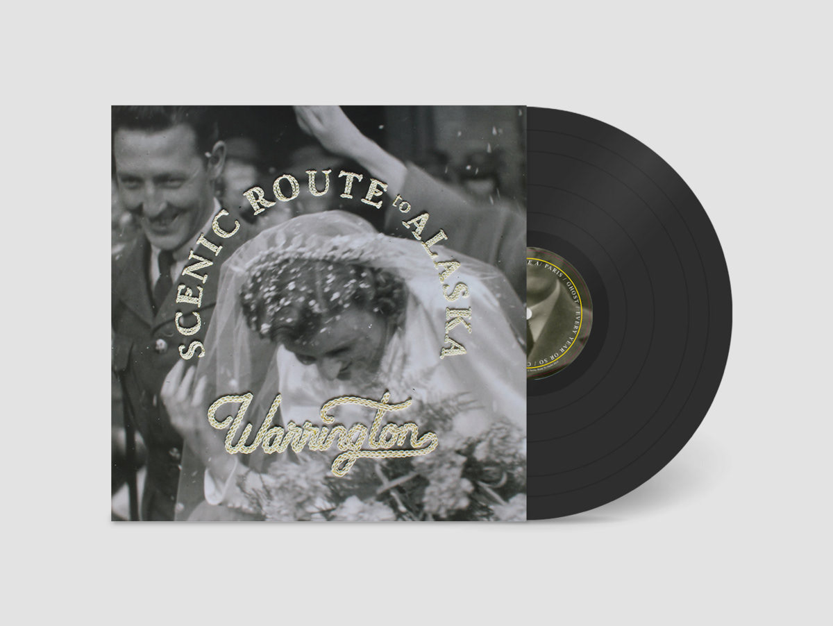
This project for Scenic Route to Alaska started with a vintage photo of one of the band member's grandparent's wartime wedding. The band was looking to produce an album cover that evoked all the warm feelings that a home-baked nostalgia pie could produce. We decided to experiment with some hand-drawn and hand-stitched typography to produce the feeling of something cross-stitched by your own grandmother. Everything produced for this album was meant to feel like the soft warm hug of a grainy old photograph and printing on a soft uncoated paper helped to translate the design feel to a tactile soft place. The stitched (non-original) photograph was then photographed and used for the final album cover.
Miscellaneous
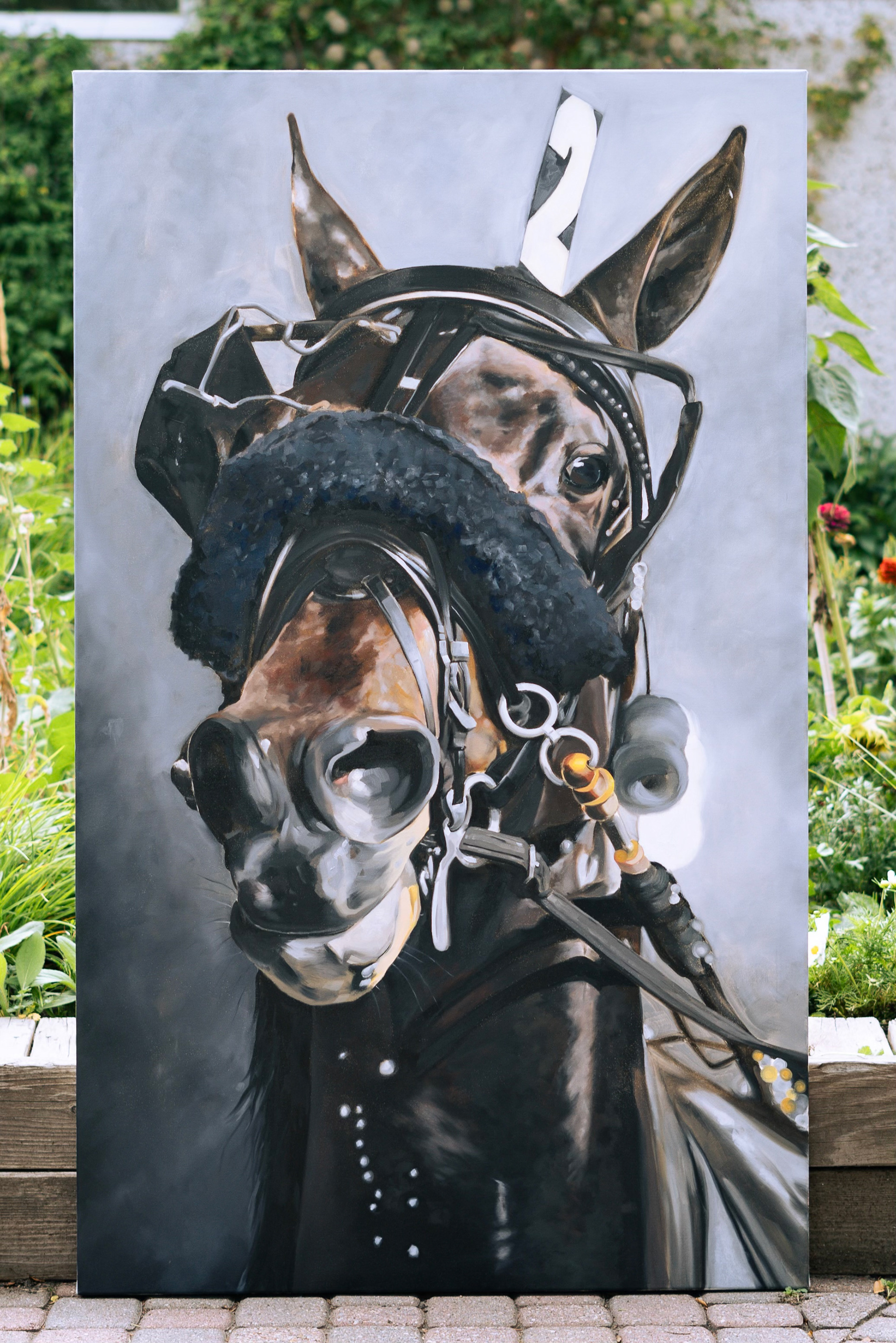
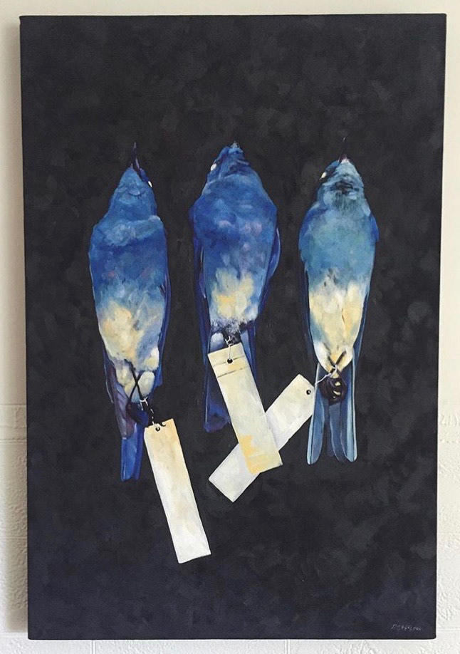
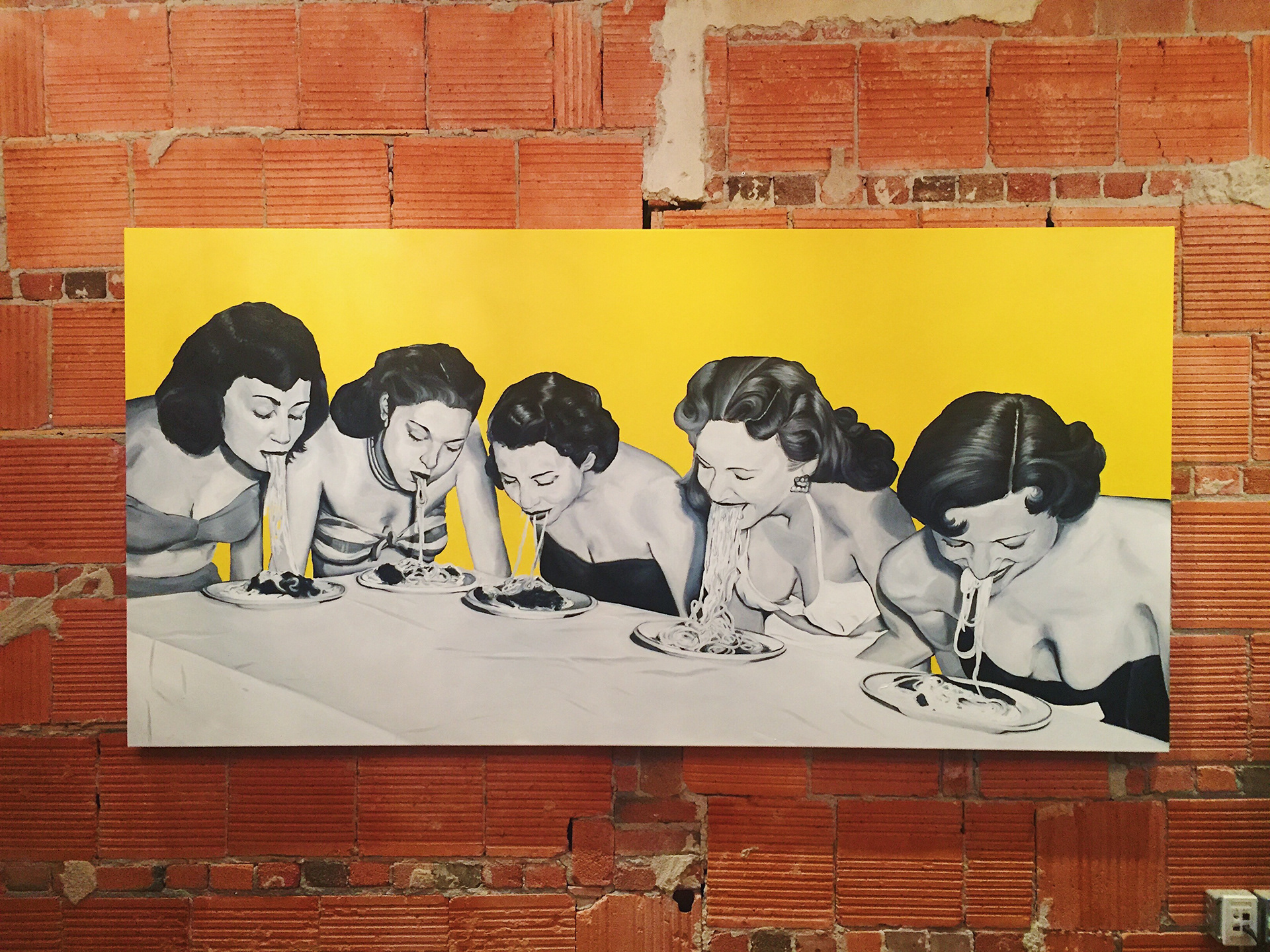
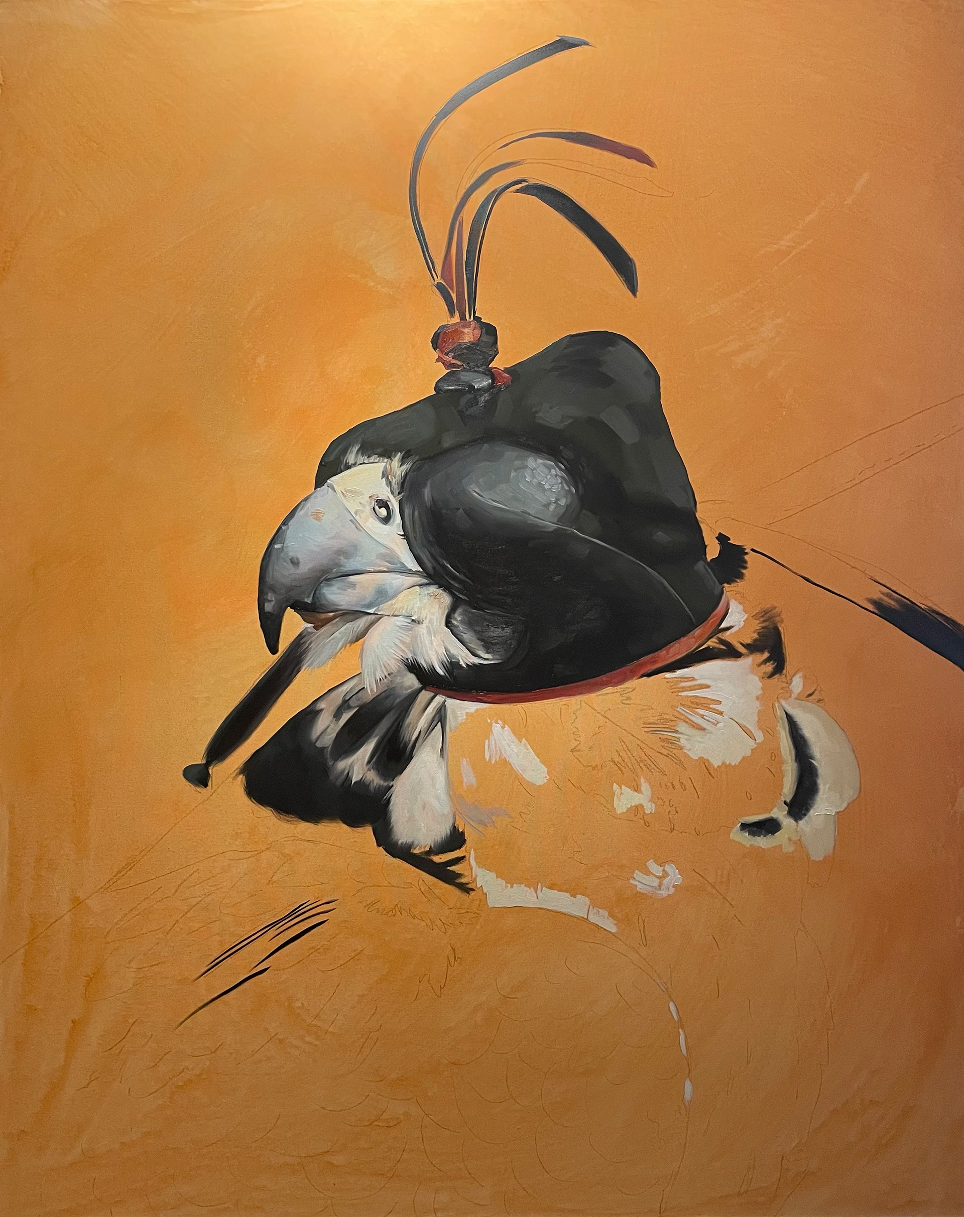
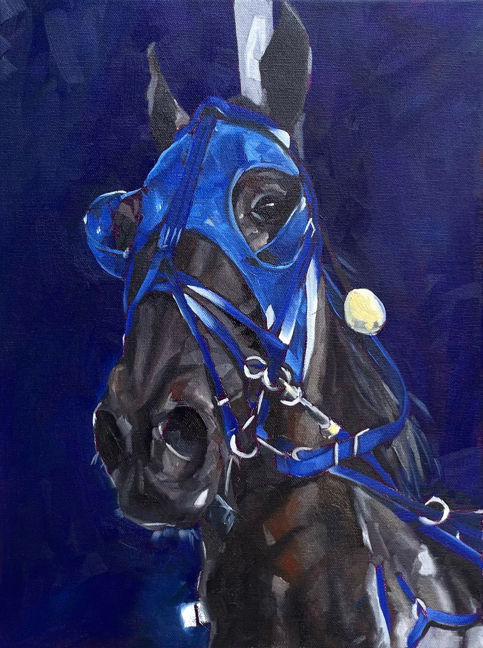
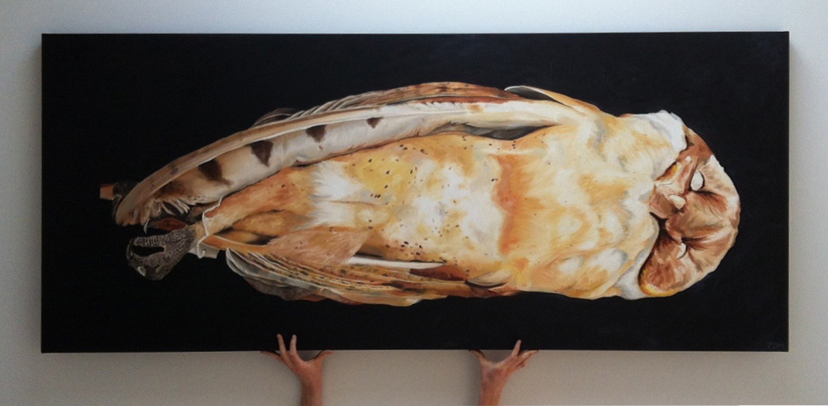
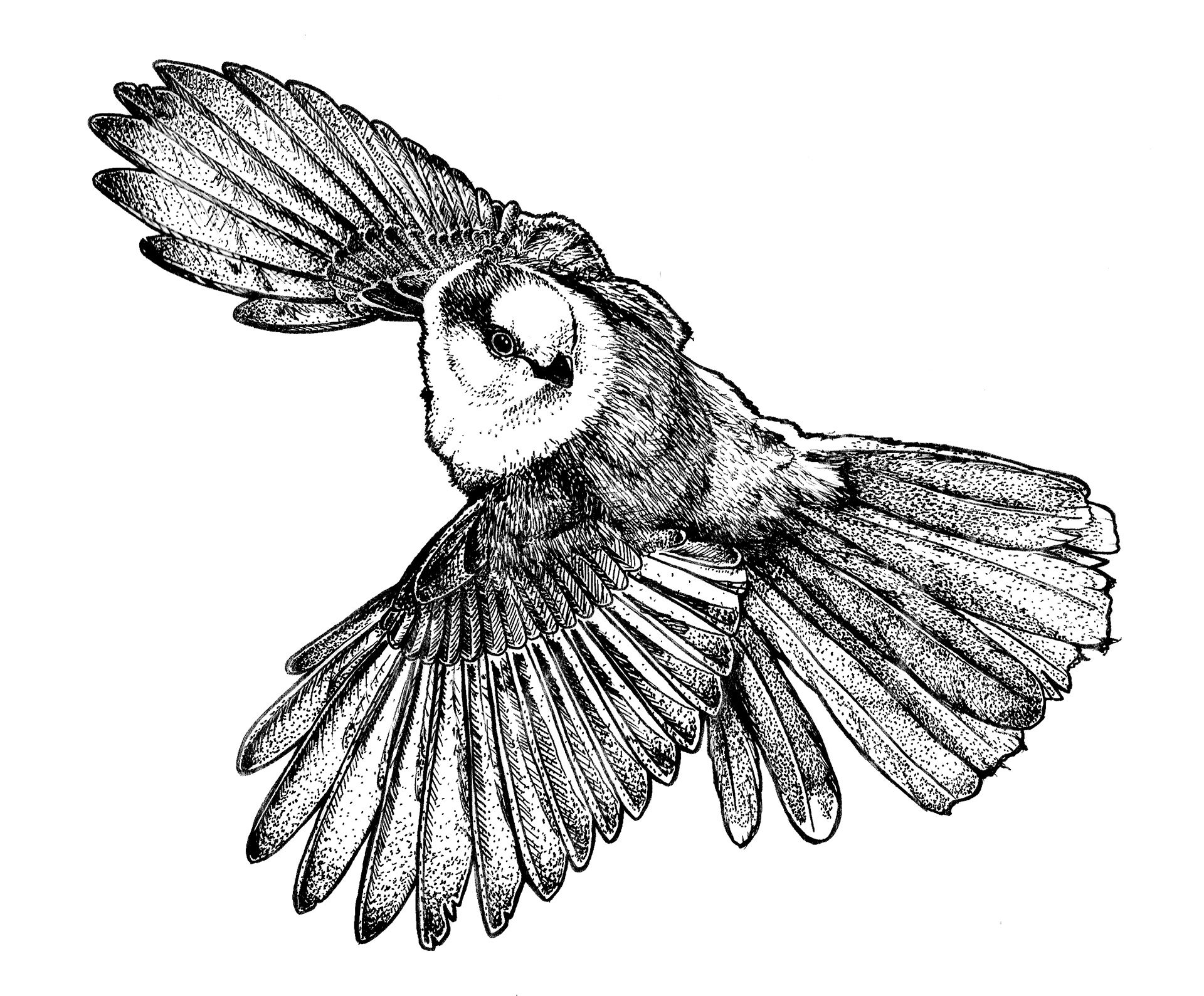
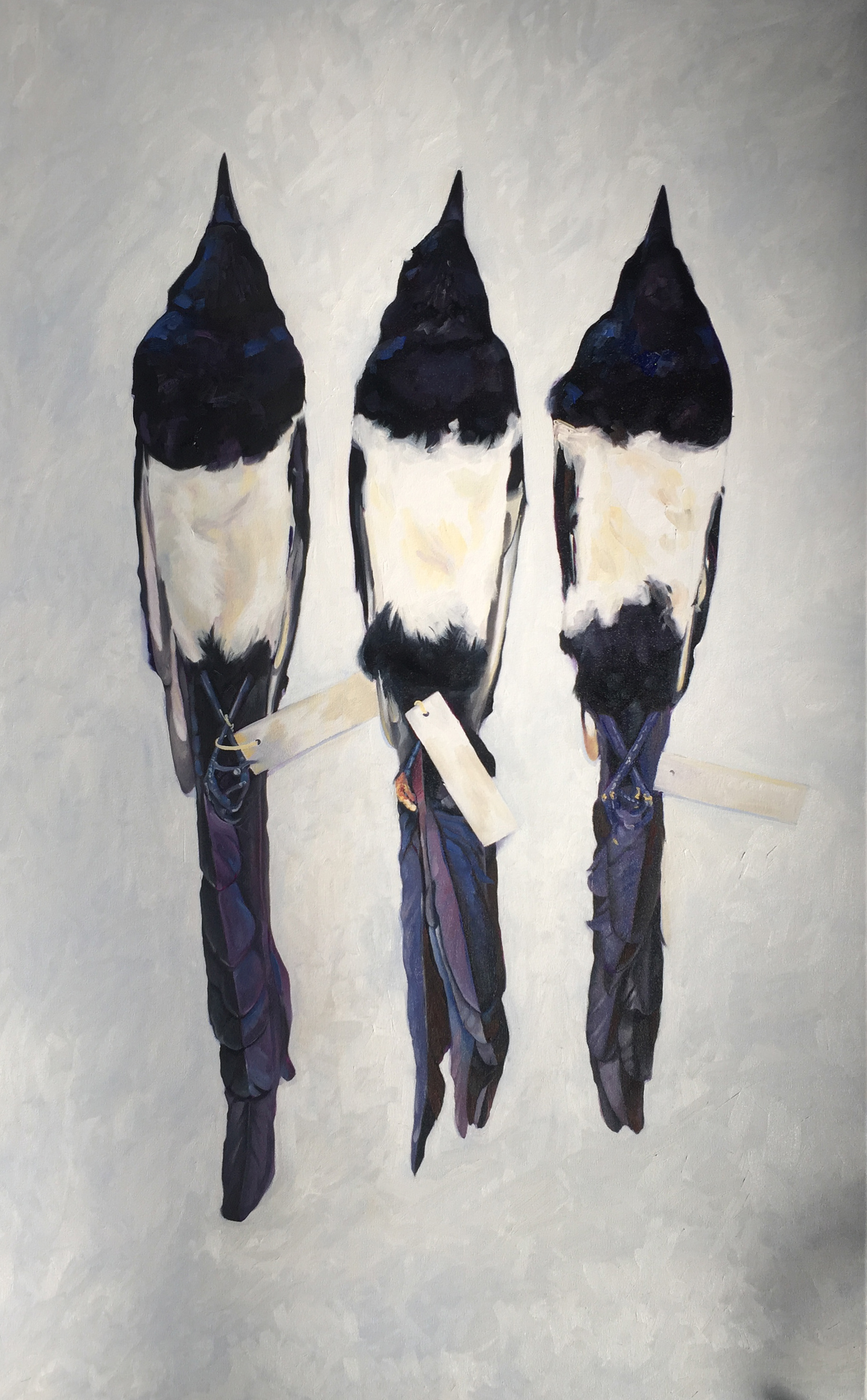
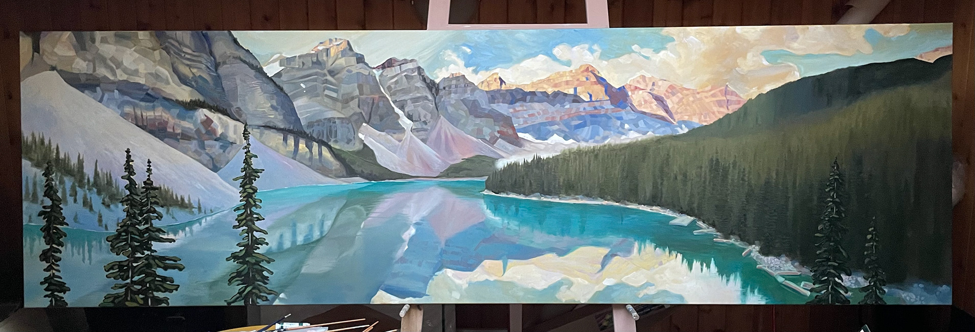
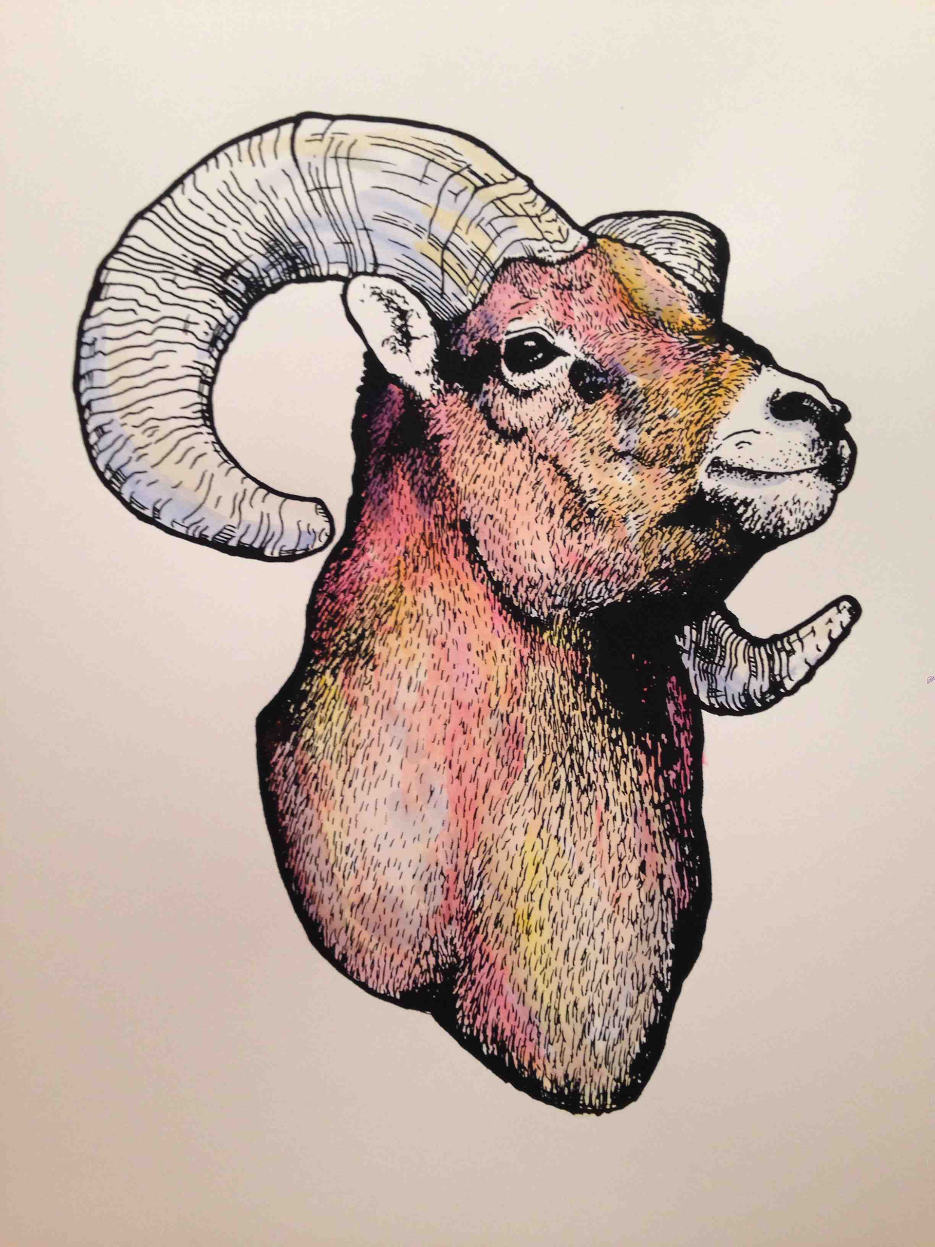
Paintings, Illustrations, and Installations
